
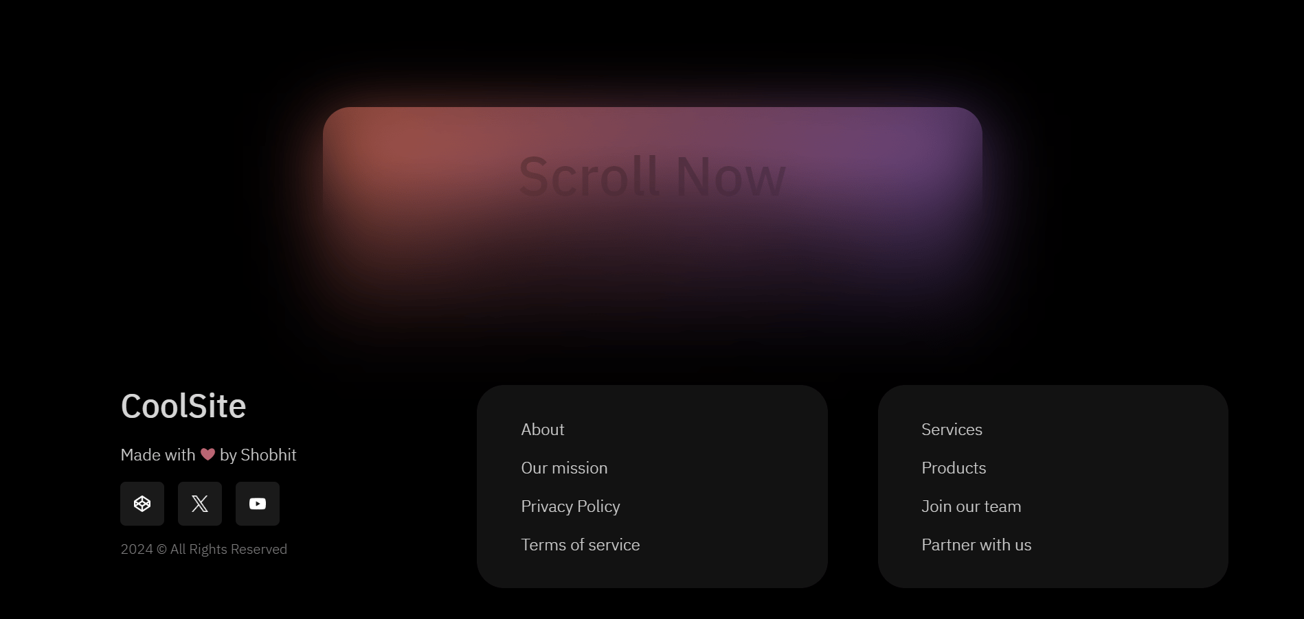
Creating a visually appealing and functional footer for your website can significantly enhance user experience and engagement. In this article, we’ll explore how to build a “Fancy Fading Footer” using HTML and CSS, perfect for adding a touch of elegance and sophistication to any webpage. We’ll delve into the key features of the footer, its implementation, and how it can be customized to fit your needs.
Key Features
- Smooth Scrolling: The footer provides a smooth scrolling experience, ensuring seamless navigation for users.
- Gradient Backgrounds: Utilizing gradient backgrounds, the footer creates a visually appealing transition effect.
- Responsive Design: The footer is designed to be responsive, ensuring it looks great on all devices.
- Social Media Links: Easily add social media links to increase your online presence.
- Blurred Backdrop: A subtle blurred backdrop effect adds a modern and stylish touch.
HTML Structure
This HTML code is designed to create a webpage with a stylish footer that includes smooth scrolling, social media links, and various informational sections. Let’s break down the code step by step, with a focus on the footer:
					<!DOCTYPE html>
<html lang="en" >
<head>
  <meta charset="UTF-8">
  <title>Fancy Fading Footer</title>
  <link rel="stylesheet" href="./style.css">

</head>
<body>
<!-- partial:index.partial.html -->
<div class="card">
  <h2 id="scroll-nowthank-me-later" class="rb-heading-index-2">Scroll Now<br>Thank Me Later</h2>
  <b><p>1 Sec Reel 😂</p></b>
  <button><a href="#footer">Scroll</a></button>
</div>
<footer id="footer">
  <div class="col col1">
    <h3 id="coolsite" class="rb-heading-index-3">CoolSite</h3>
    <p>Made with <span style="color: #BA6573;">❤</span> by Shobhit</p>
    <div class="social">
      <a href="https://codepen.io/Juxtopposed" target="_blank" class="link" rel="nofollow noopener"><img decoding="async" src="https://assets.codepen.io/9051928/codepen_1.png" alt="" /></a>
      <a href="https://twitter.com/juxtopposed" target="_blank" class="link" rel="nofollow noopener"><img decoding="async" src="https://assets.codepen.io/9051928/x.png" alt="" /></a>
      <a href="https://youtube.com/@juxtopposed" target="_blank" class="link" rel="nofollow noopener"><img decoding="async" src="https://assets.codepen.io/9051928/youtube_1.png" alt="" /></a>
    </div>
    <p style="color: #818181; font-size: smaller">2024 © All Rights Reserved</p>
  </div>
  <div class="col col2">
    <p>About</p>
    <p>Our mission</p>
    <p>Privacy Policy</p>
    <p>Terms of service</p>
  </div>
  <div class="col col3">
    <p>Services</p>
    <p>Products</p>
    <p>Join our team</p>
    <p>Partner with us</p>
  </div>
  <div class="backdrop"></div>
</footer>
<!-- partial -->
  <script  src="./script.js"></script>

</body>
</html>
Explanation of the HTML Code for the Fancy Fading Footer
Detailed Breakdown
1. Document Declaration and Head Section
<!DOCTYPE html>
<html lang="en">
<head>
  <meta charset="UTF-8">
  <title>Fancy Fading Footer</title>
  <link rel="stylesheet" href="./style.css">
</head>
<!DOCTYPE html>: Declares the document type and version of HTML.<html lang="en">: Specifies the language of the document as English.<head>: Contains meta-information about the document, including the character set, title, and link to the CSS stylesheet.
2. Body Section with Main Content
<body>
  <div class="card">
    <h2>Scroll Now<br>Thank Me Later</h2>
    <b><p>1 Sec Reel 😂</p></b>
    <button><a href="#footer">Scroll</a></button>
  </div>
<body>: The main content of the HTML document.<div class="card">: A container for the main content with a class “card”.<h2>: Heading element displaying a message.<b><p>: Bold paragraph element with additional text.<button><a href="#footer">Scroll</a></button>: A button containing a link that scrolls to the footer section when clicked.
3. Footer Section
  <footer id="footer">
    <div class="col col1">
      <h3>CoolSite</h3>
      <p>Made with <span style="color: #BA6573;">❤</span> by Shobhit</p>
      <div class="social">
        <a href="https://codepen.io/Juxtopposed" target="_blank" class="link"><img src="https://assets.codepen.io/9051928/codepen_1.png" alt="" /></a>
        <a href="https://twitter.com/juxtopposed" target="_blank" class="link"><img src="https://assets.codepen.io/9051928/x.png" alt="" /></a>
        <a href="https://youtube.com/@juxtopposed" target="_blank" class="link"><img src="https://assets.codepen.io/9051928/youtube_1.png" alt="" /></a>
      </div>
      <p style="color: #818181; font-size: smaller">2024 © All Rights Reserved</p>
    </div>
    <div class="col col2">
      <p>About</p>
      <p>Our mission</p>
      <p>Privacy Policy</p>
      <p>Terms of service</p>
    </div>
    <div class="col col3">
      <p>Services</p>
      <p>Products</p>
      <p>Join our team</p>
      <p>Partner with us</p>
    </div>
    <div class="backdrop"></div>
  </footer>
  <script src="./script.js"></script>
</body>
</html>
<footer id="footer">: The footer element with an ID of “footer”, making it the target for the scroll link.<div class="col col1">: The first column of the footer, containing:<h3>: A heading with the site name “CoolSite”.<p>: A paragraph with a heart emoji and the author’s name.<div class="social">: A container for social media links, each with:<a href="...">: Links to social media profiles.<img src="..." alt="" />: Images for social media icons.
<p>: A paragraph with copyright information.
<div class="col col2">: The second column of the footer, containing:<p>: Paragraphs with links to “About”, “Our mission”, “Privacy Policy”, and “Terms of service”.
<div class="col col3">: The third column of the footer, containing:<p>: Paragraphs with links to “Services”, “Products”, “Join our team”, and “Partner with us”.
<div class="backdrop"></div>: A div with the class “backdrop” for styling purposes.<script src="./script.js"></script>: A link to an external JavaScript file for additional functionality.
CSS Styling
This CSS code provides styling for a webpage with a fancy fading footer.
					@import url("https://fonts.googleapis.com/css?family=IBM%20Plex%20Sans:500|IBM%20Plex%20Sans:300");

:root {
  --m: 4rem;
}

* {
  box-sizing: border-box;
  scroll-behavior: smooth;
}

body {
  background-color: black;
  color: white;
  font-family: "IBM Plex Sans";
  font-weight: 300;

  display: flex;
  flex-direction: column;

  align-items: center;
  height: 190vh;
  margin: 0;
  color: #d5d5d5;
  font-size: calc(0.3 * var(--m));

}

h2 {
  font-weight: 500;
  text-align: center;
  font-size: var(--m);
  margin: 0;
}

h3 {
  font-weight: 500;
  font-size: calc(0.6 * var(--m));
  margin: 0;
}

.card {
  height: calc(8 * var(--m));
  width: calc(12 * var(--m));
  background: linear-gradient(120deg, #ff8064, #725bdc);
  color: black;
  border-radius: calc(0.5 * var(--m));

  display: flex;
  flex-direction: column;
  justify-content: center;
  align-items: center;
  gap: var(--m);

  position: fixed;
  margin: calc(2 * var(--m)) calc(5 * var(--m)) calc(5 * var(--m))
    calc(5 * var(--m));
}

button {
  background-color: #000;
  font-size: calc(0.4 * var(--m));
  border: none;
  color: #e5e5e5;
  font-family: "IBM Plex Sans";
  font-weight: 400;
  padding: calc(0.35 * var(--m)) calc(0.8 * var(--m));
  border-radius: calc(0.3 * var(--m));
}

footer {
  margin-top: 80vh;
  z-index: 500;
  width: 100%;
  height: 100vh;

  display: flex;
  flex-direction: row;
  justify-content: space-evenly;
  align-items: flex-end;
  padding: 5rem 2vw;
  position: relative;
}

footer::before {
  content: '';
  position: absolute;
  inset: 0;
  background: linear-gradient(
    rgba(0, 0, 0, 0) 5%,
    rgba(0, 0, 0, 0.3) 20%,
    rgba(0, 0, 0, 0.6) 30%,
    rgba(0, 0, 0, 0.8) 40%,
    rgba(0, 0, 0, 1) 50%,
    rgb(0, 0, 0)
  );
  z-index: -7;

}

.backdrop {
  z-index: -5;
  position: absolute;
  inset: 0;

  backdrop-filter: blur(40px);
  -webkit-backdrop-filter: blur(40px);

  mask-image: linear-gradient(
    rgba(0, 0, 0, 0),
    rgba(0, 0, 0, 0.5) 10%,
    rgba(0, 0, 0, 0.8) 20%,
    rgba(0, 0, 0, 1) 30%,
    rgb(0, 0, 0)
  );

  -webkit-mask-image: linear-gradient(
    rgba(0, 0, 0, 0),
    rgba(0, 0, 0, 0.5) 10%,
    rgba(0, 0, 0, 0.8) 20%,
    rgba(0, 0, 0, 1) 30%,
    rgb(0, 0, 0)
  );
}

.col {
  flex-direction: column;
  align-items: flex-start;
  justify-content: flex-start;
  padding: calc(0.3 * var(--m)) calc(0.8 * var(--m));
  width: 28%;
}

.col2, .col3 {
  background-color: #121212;
  border-radius: calc(0.5 * var(--m))
}

img {
  height: calc(0.3 * var(--m));
  object-fit: cover;
}

.social {
  display: flex;
  flex-direction: row;
  justify-content: flex-start;
  gap: 1rem;
}

a {
  text-decoration: none;
  color: inherit;

}

.link {
  width: calc(0.8 * var(--m));
  height: calc(0.8 * var(--m));
  background-color: rgba(255,255,255,0.1);
  border-radius: calc(0.1 * var(--m));

  display: flex;
  justify-content: center;
  align-items: center;
}


@media screen and (max-width: 1000px) {
  :root {
    --m: 3rem;
  }
}


@media screen and (max-width: 700px) {
  footer {
    flex-direction: column;
    padding: 5rem 20vw;
  }
  .col {
    width: 100%;
  }
}
Explanation of the CSS Code for a Fancy Fading Footer
Importing Fonts
@import url("https://fonts.googleapis.com/css?family=IBM%20Plex%20Sans:500|IBM%20Plex%20Sans:300");
@import url("https://fonts.googleapis.com/css?family=IBM%20Plex%20Sans:500|IBM%20Plex%20Sans:300");: Imports the IBM Plex Sans font with weights of 500 and 300 from Google Fonts.
Root Variables
:root {
  --m: 4rem;
}
:root: Defines a custom property--mwith a value of4rem. This is a CSS variable used throughout the stylesheet for consistency and easier maintenance.
Global Styles
* {
  box-sizing: border-box;
  scroll-behavior: smooth;
}
*: Applies styles to all elements.box-sizing: border-box;: Ensures the padding and border are included in the element’s total width and height.scroll-behavior: smooth;: Enables smooth scrolling for the whole document.
Body Styles
body {
  background-color: black;
  color: white;
  font-family: "IBM Plex Sans";
  font-weight: 300;
  display: flex;
  flex-direction: column;
  align-items: center;
  height: 190vh;
  margin: 0;
  color: #d5d5d5;
  font-size: calc(0.3 * var(--m));
}
body: Applies styles to the body element.background-color: black;: Sets the background color to black.color: white;: Sets the text color to white.font-family: "IBM Plex Sans";: Uses the imported font.font-weight: 300;: Sets a lighter font weight.display: flex;: Uses flexbox for layout.flex-direction: column;: Arranges child elements in a column.align-items: center;: Centers child elements horizontally.height: 190vh;: Sets the height to 190% of the viewport height.margin: 0;: Removes default margin.color: #d5d5d5;: Sets the text color to a light gray.font-size: calc(0.3 * var(--m));: Sets the font size relative to the custom property--m.
Heading Styles
h2 {
  font-weight: 500;
  text-align: center;
  font-size: var(--m);
  margin: 0;
}
h3 {
font-weight: 500;
font-size: calc(0.6 * var(–m));
margin: 0;
}
-
h2: Styles for the second-level heading.font-weight: 500;: Sets a medium font weight.text-align: center;: Centers the text.font-size: var(--m);: Sets the font size to the value of--m.margin: 0;: Removes default margin.
-
h3: Styles for the third-level heading.font-weight: 500;: Sets a medium font weight.font-size: calc(0.6 * var(--m));: Sets the font size to 60% of--m.margin: 0;: Removes default margin.
Card Styles
.card {
  height: calc(8 * var(--m));
  width: calc(12 * var(--m));
  background: linear-gradient(120deg, #ff8064, #725bdc);
  color: black;
  border-radius: calc(0.5 * var(--m));
  display: flex;
  flex-direction: column;
  justify-content: center;
  align-items: center;
  gap: var(--m);
  position: fixed;
  margin: calc(2 * var(--m)) calc(5 * var(--m)) calc(5 * var(--m)) calc(5 * var(--m));
}
.card: Styles for the card element.height: calc(8 * var(--m));: Sets the height to 8 times--m.width: calc(12 * var(--m));: Sets the width to 12 times--m.background: linear-gradient(120deg, #ff8064, #725bdc);: Applies a gradient background.color: black;: Sets the text color to black.border-radius: calc(0.5 * var(--m));: Rounds the corners.display: flex;: Uses flexbox for layout.flex-direction: column;: Arranges child elements in a column.justify-content: center;: Centers child elements vertically.align-items: center;: Centers child elements horizontally.gap: var(--m);: Sets the gap between child elements to--m.position: fixed;: Fixes the card’s position relative to the viewport.margin: calc(2 * var(--m)) calc(5 * var(--m)) calc(5 * var(--m)) calc(5 * var(--m));: Sets margins.
Button Styles
button {
  background-color: #000;
  font-size: calc(0.4 * var(--m));
  border: none;
  color: #e5e5e5;
  font-family: "IBM Plex Sans";
  font-weight: 400;
  padding: calc(0.35 * var(--m)) calc(0.8 * var(--m));
  border-radius: calc(0.3 * var(--m));
}
button: Styles for the button element.background-color: #000;: Sets the background color to black.font-size: calc(0.4 * var(--m));: Sets the font size.border: none;: Removes the default border.color: #e5e5e5;: Sets the text color.font-family: "IBM Plex Sans";: Uses the imported font.font-weight: 400;: Sets a normal font weight.padding: calc(0.35 * var(--m)) calc(0.8 * var(--m));: Sets padding.border-radius: calc(0.3 * var(--m));: Rounds the corners.
Footer Styles
footer {
  margin-top: 80vh;
  z-index: 500;
  width: 100%;
  height: 100vh;
  display: flex;
  flex-direction: row;
  justify-content: space-evenly;
  align-items: flex-end;
  padding: 5rem 2vw;
  position: relative;
}
footer: Styles for the footer element.margin-top: 80vh;: Sets the top margin to 80% of the viewport height.z-index: 500;: Sets the stacking order.width: 100%;: Sets the width to 100%.height: 100vh;: Sets the height to 100% of the viewport height.display: flex;: Uses flexbox for layout.flex-direction: row;: Arranges child elements in a row.justify-content: space-evenly;: Distributes child elements evenly.align-items: flex-end;: Aligns child elements to the bottom.padding: 5rem 2vw;: Sets padding.position: relative;: Sets the position.
Footer Before Pseudo-Element
footer::before {
  content: '';
  position: absolute;
  inset: 0;
  background: linear-gradient(
    rgba(0, 0, 0, 0) 5%,
    rgba(0, 0, 0, 0.3) 20%,
    rgba(0, 0, 0, 0.6) 30%,
    rgba(0, 0, 0, 0.8) 40%,
    rgba(0, 0, 0, 1) 50%,
    rgb(0, 0, 0)
  );
  z-index: -7;
}
footer::before: Styles for the pseudo-element before the footer.content: '';: Creates an empty content.position: absolute;: Positions the pseudo-element absolutely.inset: 0;: Sets the inset to cover the entire footer.background: linear-gradient(...);: Applies a gradient background.z-index: -7;: Sets the stacking order.
Backdrop Styles
.backdrop {
  z-index: -5;
  position: absolute;
  inset: 0;
  backdrop-filter: blur(40px);
  -webkit-backdrop-filter: blur(40px);
  mask-image: linear-gradient(
    rgba(0, 0, 0, 0),
    rgba(0, 0, 0, 0.5) 10%,
    rgba(0, 0, 0, 0.8) 20%,
    rgba(0, 0, 0, 1) 30%,
    rgb(0, 0, 0)
  );
  -webkit-mask-image: linear-gradient(
    rgba(0, 0, 0, 0),
    rgba(0, 0, 0, 0.5) 10%,
    rgba(0, 0, 0, 0.8) 20%,
    rgba(0, 0, 0, 1) 30%,
    rgb(0, 0, 0)
  );
}
.backdrop: Styles for the backdrop element.z-index: -5;: Sets the stacking order.position: absolute;: Positions the backdrop absolutely.inset: 0;: Sets the inset to cover the entire footer.backdrop-filter: blur(40px);: Applies a blur effect.-webkit-backdrop-filter: blur(40px);: Applies a blur effect for WebKit browsers.mask-image: linear-gradient(...);: Applies a gradient mask.-webkit-mask-image: linear-gradient(...);: Applies a gradient mask for WebKit browsers.
Column Styles
.col {
  flex-direction: column;
  align-items: flex-start;
  justify-content: flex-start;
  padding: calc(0.3 * var(--m)) calc(0.8 * var(--m));
  width: 28%;
}
.col2, .col3 {
background-color: #121212;
border-radius: calc(0.5 * var(–m));
}
-
.col: Styles for column elements.flex-direction: column;: Arranges child elements in a column.align-items: flex-start;: Aligns child elements to the start.justify-content: flex-start;: Justifies child elements to the start.padding: calc(0.3 * var(--m)) calc(0.8 * var(--m));: Sets padding.width: 28%;: Sets the width to 28%.
-
.col2, .col3: Styles for the second and third column elements.background-color: #121212;: Sets the background color.border-radius: calc(0.5 * var(--m));: Rounds the corners.
Image Styles
img {
  height: calc(0.3 * var(--m));
  object-fit: cover;
}
img: Styles for image elements.height: calc(0.3 * var(--m));: Sets the height.object-fit: cover;: Ensures the image covers the container.
Social Container Styles
.social {
  display: flex;
  flex-direction: row;
  justify-content: flex-start;
  gap: 1rem;
}
.social: Styles for the social container.display: flex;: Uses flexbox for layout.flex-direction: row;: Arranges child elements in a row.justify-content: flex-start;: Justifies child elements to the start.gap: 1rem;: Sets the gap between child elements.
Link Styles
a {
  text-decoration: none;
  color: inherit;
}
a: Styles for anchor elements.text-decoration: none;: Removes text decoration.color: inherit;: Inherits the text color from the parent.
Social Link Styles
.link {
  width: calc(0.8 * var(--m));
  height: calc(0.8 * var(--m));
  background-color: rgba(255,255,255,0.1);
  border-radius: calc(0.1 * var(--m));
  display: flex;
  justify-content: center;
  align-items: center;
}
.link: Styles for social link elements.width: calc(0.8 * var(--m));: Sets the width.height: calc(0.8 * var(--m));: Sets the height.background-color: rgba(255,255,255,0.1);: Sets the background color.border-radius: calc(0.1 * var(--m));: Rounds the corners.display: flex;: Uses flexbox for layout.justify-content: center;: Centers child elements horizontally.align-items: center;: Centers child elements vertically.
Media Queries
@media screen and (max-width: 1000px) {
  :root {
    --m: 3rem;
  }
}
@media screen and (max-width: 700px) {
footer {
flex-direction: column;
padding: 5rem 20vw;
}
.col {
width: 100%;
}
}
-
@media screen and (max-width: 1000px): Applies styles when the screen width is 1000px or less.:root { --m: 3rem; }: Sets the custom property--mto3rem.
-
@media screen and (max-width: 700px): Applies styles when the screen width is 700px or less.footer { flex-direction: column; padding: 5rem 20vw; }: Changes the footer layout to column and adjusts padding..col { width: 100%; }: Sets the width of columns to 100%.
Fancy Fading Footer Live Preview
See the Pen Fancy Fading Footer by Codewithshobhit (@Codewithshobhit) on CodePen.
Fancy Fading Footer Video Preview
Conclusion
This comprehensive breakdown of the CSS code reveals how various styling techniques and properties come together to create a visually appealing and responsive webpage. By utilizing custom properties, flexbox, and media queries, the design achieves consistency, flexibility, and adaptability across different screen sizes. The use of imported fonts enhances the typography, while gradients and backdrop filters add a modern aesthetic.
The footer, with its sophisticated gradient and blurred backdrop effects, stands out as a crucial element, providing both functional and visual appeal. Overall, this CSS code exemplifies best practices in modern web design, demonstrating how thoughtful styling can significantly enhance user experience and engagement.
