Creating animations with HTML and CSS can be a fun and educational way to learn about the solar system and the cycles of solstices and equinoxes. In this tutorial, we’ll go through the code for creating a simple yet visually appealing solstice and equinox animation, focusing on key concepts related to these astronomical events. Let’s dive in and understand how to create this animation step by step.
Understanding Solstices and Equinoxes
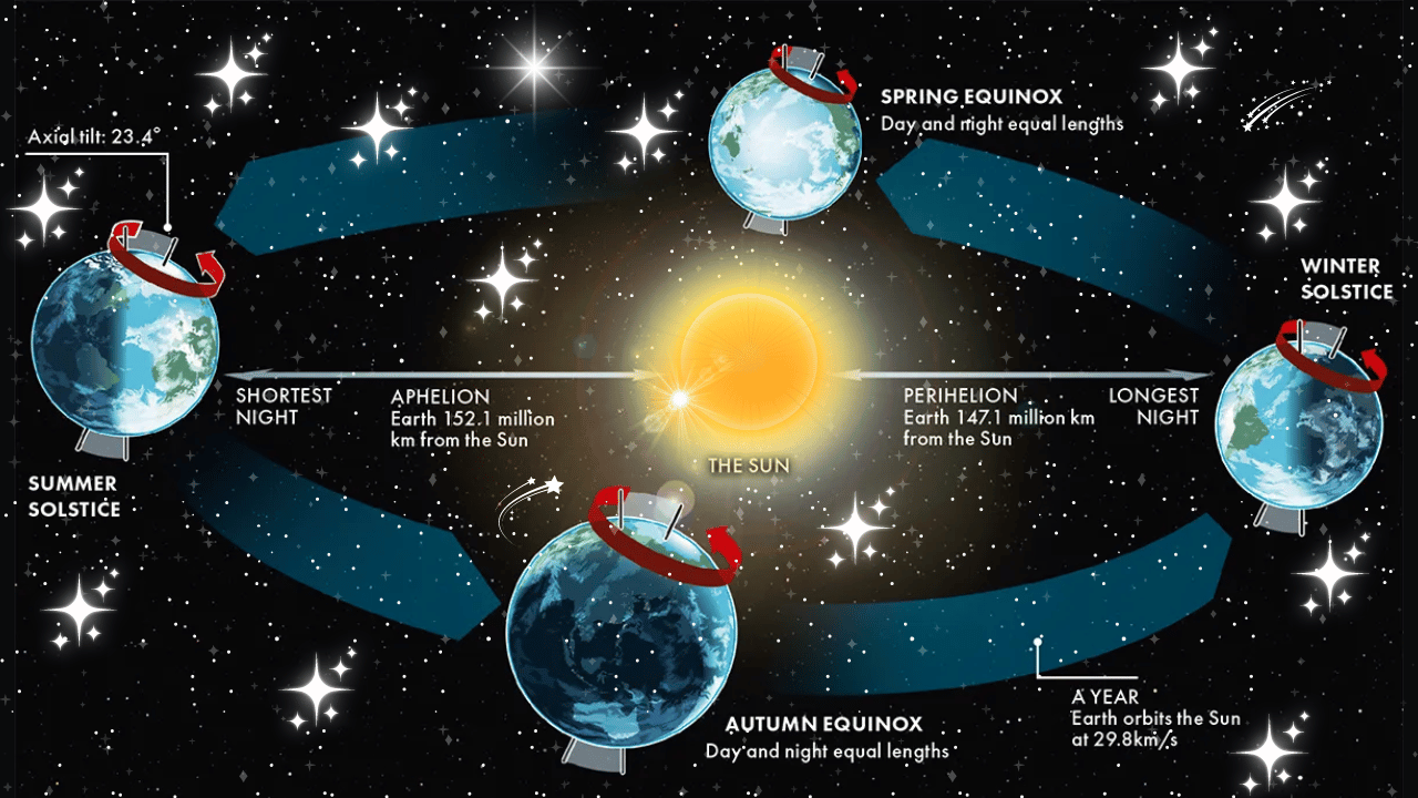
Solstices and equinoxes are key points in the Earth’s orbit around the Sun. The solstices, which occur in June and December, mark the times when the Sun is at its highest or lowest point in the sky at noon, leading to the longest and shortest days of the year. The equinoxes, occurring in March and September, are times when day and night are nearly equal in length. These events are essential in understanding the changing seasons.
The HTML Structure
Let’s start with the HTML structure. This is where we define the basic layout of our animation.
<!DOCTYPE html>
<html lang="en" >
<head>
<meta charset="UTF-8">
<title>Solstice & Equinox (Scroll Snap [pure CSS]</title>
<link rel="stylesheet" href="./style.css">
</head>
<body>
<!-- partial:index.partial.html -->
<body>
<!-- We've just welcomed the solstice (summer solstice, here north of the equator)... so why not embark (oops, scroll!) on an astronomical-themed journey? Just a bit of scroll-snap and we're on board — and if you're using Chrome, you can also enjoy a touch of (basic) CSS scroll-driven animations!
[Please note that this is just an approximation to illustrate the stages of solstices and equinoxes (so no Moon, aphelion, or perihelion… but feel free to fork and play around ;) ] | CodePen Challenge, June 2024, "Scroll Snap" -->
<header>
<p>Solstice & Equinox</p>
</header>
<main>
<div class="sections">
<div class="section left" data-section="1">
<div class="planet">
<div class="tag">
<p>June solstice</p>
</div>
<div class="atmosphere"></div>
<div class="earth">
<div class="eurasia"></div>
<div class="america"></div>
<div class="africa"></div>
<div class="oceania"></div>
</div>
</div>
</div>
<div class="section center" data-section="2">
<div class="planet">
<div class="tag">
<p>March equinox</p>
</div>
<div class="atmosphere"></div>
<div class="earth">
<div class="eurasia"></div>
<div class="america"></div>
<div class="africa"></div>
<div class="oceania"></div>
</div>
</div>
<div class="sun">
<small class="sunwarn">[adjust screen height]</small>
</div>
<div class="planet">
<div class="tag">
<p>September equinox</p>
</div>
<div class="atmosphere"></div>
<div class="earth">
<div class="eurasia"></div>
<div class="america"></div>
<div class="africa"></div>
<div class="oceania"></div>
</div>
</div>
</div>
<div class="section right" data-section="3">
<div class="planet">
<div class="tag">
<p>December solstice</p>
</div>
<div class="atmosphere"></div>
<div class="earth">
<div class="eurasia"></div>
<div class="america"></div>
<div class="africa"></div>
<div class="oceania"></div>
</div>
</div>
</div>
<div class="orbit">
<div class="o-info left top">
<p><ruby>spring<rp>(</rp>
<rt>NH</rt>
<rp>)</rp>
</ruby>/<ruby>autumn<rp>(</rp>
<rt>SH</rt>
<rp>)</rp>
</ruby></p>
</div>
<div class="o-info left bottom">
<p><ruby>summer<rp>(</rp>
<rt>NH</rt>
<rp>)</rp>
</ruby>/<ruby>winter<rp>(</rp>
<rt>SH</rt>
<rp>)</rp>
</ruby></p>
</div>
<div class="o-info right top">
<p><ruby>winter<rp>(</rp>
<rt>NH</rt>
<rp>)</rp>
</ruby>/<ruby>summer<rp>(</rp>
<rt>SH</rt>
<rp>)</rp>
</ruby></p>
</div>
<div class="o-info right bottom">
<p><ruby>autumn<rp>(</rp>
<rt>NH</rt>
<rp>)</rp>
</ruby>/<ruby>spring<rp>(</rp>
<rt>SH</rt>
<rp>)</rp>
</ruby></p>
</div>
</div>
<div class="rocket">
<div class="r-body">
<span>scroll</span>
</div>
<div class="r-wings"></div>
<div class="r-porthole"></div>
<div class="r-flames"></div>
</div>
</div>
</main>
<footer>
<p>Scroll<span class="i-more" tabindex="0" role="tooltip">
<i>*</i>
<span>#cpc-scroll-snap</span>
</span>left/right</p>
</footer>
</body>
<!-- partial -->
<script src="./script.js"></script>
</body>
</html>
Explaining the HTML Code
- HTML and Head Section: The document starts with the
<!DOCTYPE html>declaration, which defines the document type and version of HTML. The<head>section includes the character set and the title of the document, along with a link to the CSS file. - Body Section: The
<body>contains the main content of the document.- Header: Contains the title of the animation.
- Main Section: This is where the main animation takes place, divided into three sections representing the June solstice, March equinox, and December solstice. Each section contains a
planetdiv representing the Earth at different points in its orbit, with labels for each event. - Footer: Provides instructions for scrolling through the animation.
					@import url('https://fonts.googleapis.com/css2?family=Space+Grotesk:wght@300..700&display=swap');

*,
*::before,
*::after {
  box-sizing: border-box;
  -webkit-font-smoothing: antialiased;
  -moz-osx-font-smoothing: grayscale;
  text-rendering: optimizeLegibility;
}

:root {
  --text: .7rem;
  --text-xs: .6rem;
  --space: 1rem;
  --black: #000;
  --white: #fff;
  --grey-light: #d7d7d7;
  --blue: #0050ff;
  --green: #3dc200;
  --yellow: #ffff00;
}

@media only screen and (min-width: 500px) {
  :root {
    --text: .8rem;
    --text-xs: .7rem;
  }
}

@media only screen and (min-width: 1025px) and (min-height: 500px) {
  :root {
    --text: 1rem;
    --text-xs: .85rem;
    --space: 1.6rem;
  }
}

html {
  width: 100%;
  height: 100%;
  font-family: "Space Grotesk", sans-serif;
  font-size: 16px;
  font-optical-sizing: auto;
  font-style: normal;
  scrollbar-gutter: auto;
  scrollbar-width: thin;
}

@media (prefers-reduced-motion: no-preference) {
  html {
    scroll-behavior: smooth;
  }
}

body {
  height: 100%;
  width: 100%;
  margin: 0;
  padding: 0;
  position: relative;
  background: var(--black);
  background-image: radial-gradient(ellipse at center, #1c2330 0%, var(--black) 100%);
  color: var(--white);
}

p {
  font-weight: 600;
  font-size: var(--text);
  text-transform: uppercase;
  white-space: nowrap;
  margin: 0;
}

h2,
h3,
h4,
h5,
h6 {
  font-weight: 400;
  font-size: var(--text);
  text-transform: uppercase;
  line-height: 1.3;
  margin: 0;
}

p {
  font-size: var(--text);
  line-height: 1.3;
  margin: 0;
}

small {
  font-size: var(--text-xs);
}

header,
footer {
  position: fixed;
  padding: .4rem 1rem;
  background: linear-gradient(90deg, #6a6a6a, var(--grey-light));
  border-radius: 0 0 20px 20px;
  box-shadow: 0px 0px 1px var(--white) inset, 0px 0px 1px #000 inset;
  pointer-events: none;
  z-index: 999;
}

header {
  top: 0;
  left: 51%; /* optical fix */
  transform: translateX(-50%);
}

footer {
  bottom: 0;
  left: 51%;
  transform: translateX(-50%);
  border-radius: 20px 20px 0 0;
}

header h1,
footer p {
  color: rgba(255, 255, 255, 0.4);
  text-shadow: 1px 0px 1px rgba(0, 0, 0, 0.6), -.5px 0px .5px rgba(255, 255, 255, 0.2), -.25px 0px .25px rgba(255, 255, 255, 0.5);
  font-size: var(--text);
  font-weight: 500;
  text-transform: uppercase;
  letter-spacing: .1rem;
  line-height: 1;
  white-space: nowrap;
  pointer-events: auto;
}

footer p {
  font-size: var(--text-xs);
}

.i-more {
  display: inline-block;
  position: relative;
  margin: 0 .3rem 0 -.3rem;
  font-size: smaller;
  letter-spacing: 0;
  line-height: 1;
  top: -.15rem;
  cursor: pointer;
}

.i-more span {
  position: absolute;
  top: -50%;
  left: 50%;
  transform: translateX(-32%) translateY(100%);
  visibility: hidden;
  opacity: 0;
  overflow: hidden;
  clip: rect(0,0,0,0);
  transition: opacity 1s;
  text-align: center;
  font-weight: lighter;
}

.i-more:hover span,
.i-more:focus span {
  transform: translateX(-32%) translateY(-100%);
  visibility: visible;
  opacity: .8;
  clip: unset;
}

main {
  display: grid;
  place-content: center;
  height: 100%;
  width: 100%;
  overscroll-behavior: contain;
  overflow-y: hidden;
  position: relative;
  z-index: 1;
}

.sections {
  display: grid;
  grid-template-columns: repeat(3, 1fr);
  grid-template-rows: repeat(1, 1fr);
  width: 100%;
  overflow: auto;
  overflow-y: hidden;
  scroll-snap-type: x mandatory;
  overscroll-behavior: contain;
  position: relative;
}

.section {
  padding: calc(var(--space)*2);
  height: 100vh;
  width: 65vw;
  scroll-snap-align: center;
  position: relative;
  background-image:
    radial-gradient(var(--white), rgba(255, 255, 255, .2) 1px, transparent 3px),
    radial-gradient(var(--white), rgba(255, 255, 255, .2) .5px, transparent 3px),
    radial-gradient(var(--white), rgba(255, 255, 255, .2) 1px, transparent 3px),
    radial-gradient(var(--white), rgba(255, 255, 255, .2) .5px, transparent 3px),
    radial-gradient(var(--white), rgba(255, 255, 255, .2) 1px, transparent 3px),
    radial-gradient(var(--white), rgba(255, 255, 255, .2) 1px, transparent 3px);
  background-size: 550px 550px, 350px 350px, 250px 250px, 150px 140px, 350px 350px, 200px 70px;
  background-position: 0 0, 40px 70px, 200px 280px, 80px 120px, 100px 20px, 80px 120px;
}

.sections p {
  display: inline-block;
  font-size: var(--text-xs);
  text-transform: uppercase;
  line-height: 1;
  color: rgba(255, 255, 255, 0.4);
  text-shadow: -.5px 0px .5px rgba(255, 255, 255, 0.2);
}

@media only screen and (min-width: 1025px) and (min-height: 500px) {
  .sections p {
    font-size: var(--text);
  }
}

.orbit {
  position: absolute;
  width: calc(195vw - 70%);
  height: 10vw;
  top: calc(100vh - 50% - 4vw);
  left: 35%;
  pointer-events: none;
}

.orbit:before,
.orbit:after {
  content: "";
  position: absolute;
  width: 100%;
  height: 100%;
  border-bottom: 1px dotted var(--grey-light);
  border-radius: 0 0 50% 50%;
  z-index: 2;
}

.orbit:before {
  border-bottom: 0;
  border-top: 1px dotted var(--grey-light);
  border-radius: 50% 50% 0 0;
  z-index: -1;
}

.o-info {
  position: absolute;
  z-index: 3;
}

.o-info.top {
  top: calc(-1.4*var(--text));
}

.o-info.left {
  left: 20%;
  transform: rotate(-2.5deg);
}

.o-info.right {
  left: unset;
  right: 20%;
  transform: rotate(2.8deg);
}

.o-info.left.bottom {
  transform: rotate(2.8deg);
}

.o-info.right.bottom {
  transform: rotate(-2.8deg);
}

.o-info.bottom {
  top: unset;
  bottom: calc(-1.4*var(--text));
}

.o-info p {
  text-transform: none;
  pointer-events: auto;
}

.o-info.bottom ruby {
  ruby-position: under;
}

/* safari :/ */
@supports (-webkit-hyphens: none) {
  ruby {
    display: inline-flex;
  }
}

.sun {
  width: 16vw;
  height: 16vw;
  position: absolute;
  top: calc(50% - 8vw);
  left: calc(50% - 8vw);
  border-radius: 50%;
  background: var(--yellow);
  box-shadow: 0px 0px 100px var(--yellow), 0px 0px 100px var(--yellow);
  text-align: center;
  pointer-events: none;
  z-index: 2;
}

.sun:after {
  content: "";
  position: absolute;
  width: 100%;
  height: 100%;
  top: 0;
  left: 0;
  border-radius: 50%;
  background: radial-gradient(transparent 0%, rgba(255, 197, 0, 0.5) 30%, transparent 100%) 0px 0px, radial-gradient(rgb(255, 208, 0) 0%, transparent 50%) 0 0, radial-gradient(transparent 0%, rgba(160, 0, 0, 0.3) 30%, transparent 100%) 0px 0px;
  background-size: 80% 50%, 60% 60%, 80% 80%;
  box-shadow: 0px 0px 50px rgba(255, 255, 255, 0.5);
  animation-name: textureRotate;
  animation-duration: 30s;
  mix-blend-mode: darken;
  animation-iteration-count: infinite;
  animation-timing-function: linear;
}

.sunwarn {
  position: relative;
  top: 25%;
  font-weight: bolder;
  color: red;
  line-height: 1;
  display: none;
  z-index: 99999;
}

@media only screen and (width: 500px) and (max-height: 200px),
only screen and (min-aspect-ratio: 4/1) {
  .sunwarn {
    display: block;
  }
}

.planet {
  width: 14vw;
  height: 14vw;
  top: calc(50% - 7vw);
  left: calc(50% - 7vw);
  border-radius: 50%;
  background-color: var(--blue);
  position: absolute;
  z-index: 2;
}

[data-section="2"] .planet {
  top: calc(50% - 12vw);
  z-index: 0;
}

[data-section="2"] .planet:last-of-type {
  top: calc(50% - 2vw);
  z-index: 4;
}

.tag {
  position: absolute;
  top: calc(-1*var(--space));
  left: 0;
  right: 0;
  display: flex;
  flex-direction: column;
  align-items: center;
  justify-content: center;
  text-align: center;
  white-space: nowrap;
  z-index: 99;
}

[data-section="2"] .planet:last-of-type .tag {
  top: unset;
  bottom: calc(-1*var(--space));
}

@media only screen and (min-width: 900px) and (max-height: 500px) {
  [data-section="2"] .planet .tag {
    top: calc(-1*var(--space) - .25rem);
  }

  [data-section="2"] .planet:last-of-type .tag {
    top: unset;
    bottom: calc(-1*var(--space) - .25rem);
  }
}

@media only screen and (min-width: 900px) and (max-height: 420px) {
  [data-section="2"] .planet .tag {
    top: calc(10% + 1vw);
    width: fit-content;
    padding: 0 .5rem .1rem;
    justify-self: center;
    background: rgba(8, 8, 8, 0.5);
    border-radius: 10px;
  }

  [data-section="2"] .planet:last-of-type .tag {
    top: unset;
    bottom: calc(10% + 1vw);
  }
}

.planet::after {
  content: '';
  width: 100%;
  height: 100%;
  border-radius: 50%;
  position: absolute;
  right: 0;
  top: 0;
  background-image:
    radial-gradient(rgba(255, 255, 255, .5),
      rgba(255, 255, 255, .5) 10px, transparent 50px);
  background-size: 50% 40%;
  background-position: 10% 20%;
  mix-blend-mode: overlay;
}

.atmosphere {
  width: 14vw;
  height: 14vw;
  border-radius: 50%;
  position: absolute;
  mix-blend-mode: overlay;
  opacity: .6;
  z-index: 2;
  background:
    radial-gradient(transparent 0%, rgba(255, 255, 255, .5) 30%, transparent 100%) 0px 0px,
    radial-gradient(rgba(255, 255, 255, 1) 0%, transparent 50%) 0 0,
    radial-gradient(transparent 0%, rgba(255, 255, 255, .5) 30%, transparent 100%) 0px 0px;
  background-color: rgba(0, 0, 0, 0.3);
  background-size: 80% 50%, 60% 60%, 80% 80%;
  box-shadow: 0px 0px 50px rgba(255, 255, 255, 0.5);
  animation-name: textureRotate;
  animation-duration: 30s;
  animation-iteration-count: infinite;
  animation-timing-function: linear;
}

@media (prefers-reduced-motion: no-preference) {
  @keyframes textureRotate {
    from {
      transform: rotate(0deg);
    }

    to {
      transform: rotate(360deg);
    }
  }
}

.earth {
  width: 14vw;
  height: 14vw;
  clip-path: circle(50%);
  overflow: hidden;
  transform: rotate(23.45deg);
  /* Earth's axis is tilted! */
}

/* approximations :) */
.eurasia {
  width: 80%;
  height: 70%;
  background: var(--green);
  clip-path: polygon(0% 55%, 5% 45%, 10% 45%, 10% 45%, 10% 38%, 0% 40%, 10% 22%, 29% 22%, 36% 0%, 56% 22%, 68% 22%, 81% 20%, 93% 19%, 99% 26%, 96% 43%, 73% 80%, 65% 68%, 60% 70%, 53% 80%, 40% 80%, 36% 75%, 30% 56%, 46% 58%, 37% 61%, 30% 72%, 25% 60%, 20% 60%, 15% 62%, 16% 58%, 17% 58%, 10% 55%, 10% 55%, 2% 65%);
  position: absolute;
  transform: rotate(353deg);
  top: -9%;
  left: 50%;
  z-index: 1;
}

.america {
  width: 100%;
  height: 150%;
  background: var(--green);
  clip-path: polygon(15% 27%, 2% 10%, 17% 5%, 10% 0%, 42% 0%, 42% 0%, 44% 10%, 35% 8%, 40% 16%, 25% 28%, 28% 30%, 30% 35%, 56% 37%, 56% 40%, 70% 40%, 70% 48%, 68% 50%, 65% 65%, 68% 75%, 58% 62%, 52% 52%, 45% 52%, 42% 48%, 40% 42%, 44% 38%, 45% 34%, 31% 36%, 27% 36%);
  transform: rotate(10deg);
  position: absolute;
  top: 8%;
  left: -26%;
  z-index: 1;
}

.africa {
  width: 68%;
  height: 68%;
  background-color: var(--green);
  clip-path: polygon(5% 38%, 5% 20%, 10% 20%, 25% 17%,
      30% 15%, 40% 25%, 45% 28%, 70% 30%, 65% 48%,
      55% 60%, 40% 95%, 30% 89%, 26% 74%, 26% 50%,
      16% 50%);
  position: absolute;
  top: 30%;
  left: 50%;
  z-index: 1;
}

.oceania {
  width: 48%;
  height: 38%;
  background: var(--green);
  clip-path: polygon(15% 40%,
      29% 10%, 44% 19%, 57% 31%, 65% 49%,
      60% 81%, 49% 88%, 35% 100%, 26% 80%,
      15% 75%, 15% 50%);
  position: absolute;
  bottom: 5%;
  right: -40%;
  z-index: 1;
}

div[data-section="1"] .planet::before,
div[data-section="2"] .planet:last-of-type::before,
div[data-section="3"] .planet::before {
  content: '';
  border-radius: 49%; /* optical fix */
  width: 14vw;
  height: 14vw;
  position: absolute;
  left: 0;
  top: 0;
  background: linear-gradient(90deg, rgba(0, 0, 0, .9), rgba(0, 0, 0, .8) 48%, rgba(0, 0, 0, 0));
  z-index: 2;
}

div[data-section="2"] .planet:last-of-type::before {
  background: radial-gradient(circle at 50% 100%, rgba(0, 0, 0, .8) 60%, rgba(0, 0, 0, 0.5));
}

div[data-section="3"] .planet::before {
  background: linear-gradient(-90deg, rgba(0, 0, 0, .9), rgba(0, 0, 0, .8) 48%, rgba(0, 0, 0, 0));
}

.rocket {
  height: 5vw;
  width: 24vw;
  padding-left: 13vw;
  display: flex;
  align-items: center;
  justify-content: center;
  position: absolute;
  bottom: 4rem;
  overflow: hidden;
  transform: translateY(0) translateX(calc(41vw - 100%)) rotate(0deg) scale(1);
  z-index: 99;
  pointer-events: none;
}

@media (prefers-reduced-motion: no-preference) {

  /* use Chrome to test :) */
  @supports (animation-timeline: scroll()) {
    .rocket {
      animation: rocketScroll linear both;
      animation-timeline: scroll(x);
      animation-range: contain;
      animation-duration: 1ms;
    }
  }

  @keyframes rocketScroll {
    0% {
      transform: translateY(0) translateX(calc(41vw - 100%)) rotate(0deg) scale(1);
    }

    25% {
      transform: translateY(-50vh) translateX(calc(68vw - 100%)) rotate(-30deg) scale(.5);
    }

    50% {
      transform: translateY(-60vh) translateX(calc(110vw - 100%)) rotate(0deg) scale(0);
    }

    75% {
      transform: translateY(-50vh) translateX(calc(140vw - 100%)) rotate(30deg) scale(-.5);
    }

    100% {
      transform: translateY(0) translateX(calc(179vw - 100%)) rotate(0) scale(-1);
    }
  }

}

.r-body {
  clip-path: polygon(75% 0%, 90% 50%, 75% 100%, 0% 100%, 0% 0%);
  background: radial-gradient(var(--white) 0%, transparent 50%) 0 0, radial-gradient(rgb(90, 90, 90) 0%, transparent 70%) 62px 0;
  background-color: var(--white);
  background-size: 71px 4px;
  box-shadow: -3vw 0 5px rgb(105, 105, 105) inset, -3vw 0 5px rgb(105, 105, 105) inset;
  height: 2vw;
  width: 11vw;
  color: var(--black);
  position: absolute;
  z-index: 6;
}

.r-body::after {
  content: '';
  clip-path: polygon(75% 0%, 90% 50%, 75% 100%, 0% 100%, 0%, 0%);
  background-image: linear-gradient(0deg, rgba(255, 255, 255, 0) 0%, var(--white) 50%, transparent 100%);
  width: 100%;
  height: 100%;
  position: absolute;
  z-index: 6;
  mix-blend-mode: overlay;
}

.r-body span {
  position: absolute;
  top: 50%;
  left: 15%;
  width: .5vw;
  height: .5vw;
  border: .5vw ridge;
  border-color: #404040 transparent transparent var(--black);
  transform: translateY(-50%) rotate(135deg);
  opacity: .2;
  overflow: hidden;
  text-indent: -9999px;
  z-index: 7;
}

.r-wings {
  background: radial-gradient(var(--white) 0%, transparent 50%) 0 0, radial-gradient(rgb(90, 90, 90) 0%, transparent 70%) 0 79px;
  background-color: var(--white);
  background-size: 9px 62px;
  clip-path: polygon(30% 0%, 70% 0%, 100% 100%, 0% 100%);
  transform: translateX(-1vw) rotate(90deg);
  box-shadow: 0 0 10px var(--black) inset;
  height: 5vw;
  width: 5vw;
  position: absolute;
  z-index: 5;
}

.r-porthole {
  background-color: rgb(200, 200, 200);
  box-shadow: 0 0 1px rgb(0, 0, 0);
  border-radius: 50%;
  height: 1.2vw;
  width: 1.2vw;
  margin-left: 3vw;
  position: absolute;
  z-index: 7;
}

.r-porthole::before {
  content: '';
  position: absolute;
  background: radial-gradient(circle at 20% 50%, var(--white) 0%, transparent 40%);
  border-radius: 50%;
  width: 100%;
  height: 100%;
  z-index: 7;
}

.r-flames {
  position: absolute;
  width: 16vw;
  height: 2vw;
  left: 2vw;
  border-radius: 50%;
  background-image: radial-gradient(at right, rgb(135, 0, 255) 0%, rgb(0, 110, 255) 10%, rgb(114 220 248) 28%, rgba(220, 245, 245, 1) 40%, rgba(220, 245, 245, 1) 44%, rgba(220, 245, 245, .5) 46%, rgb(255, 255, 255, 0) 60%);
  mix-blend-mode: overlay;
  animation: flameScale 2s infinite;
}

@media (prefers-reduced-motion: no-preference) {
  @keyframes flameScale {
    50% {
      transform: scaleX(1.5);
    }

    100% {
      transform: scaleX(0.5);
    }
  }
}
Explaining the CSS Code
- Basic Styles: We set up the basic styles for the document, including font import, box-sizing, and text rendering.
- Root Variables: We define CSS variables for consistent styling across different screen sizes.
- Media Queries: We adjust the text size and spacing based on screen width.
- Global Styles: We style the
htmlandbodyelements, setting the background, font family, and other global properties. - Header and Footer: Fixed position with styling to make them visually distinct.
- Sections and Planets: Flexbox layout for centering content, with specific styles for each section. The
.planetdivs are styled to look like planets, with rotating animations.
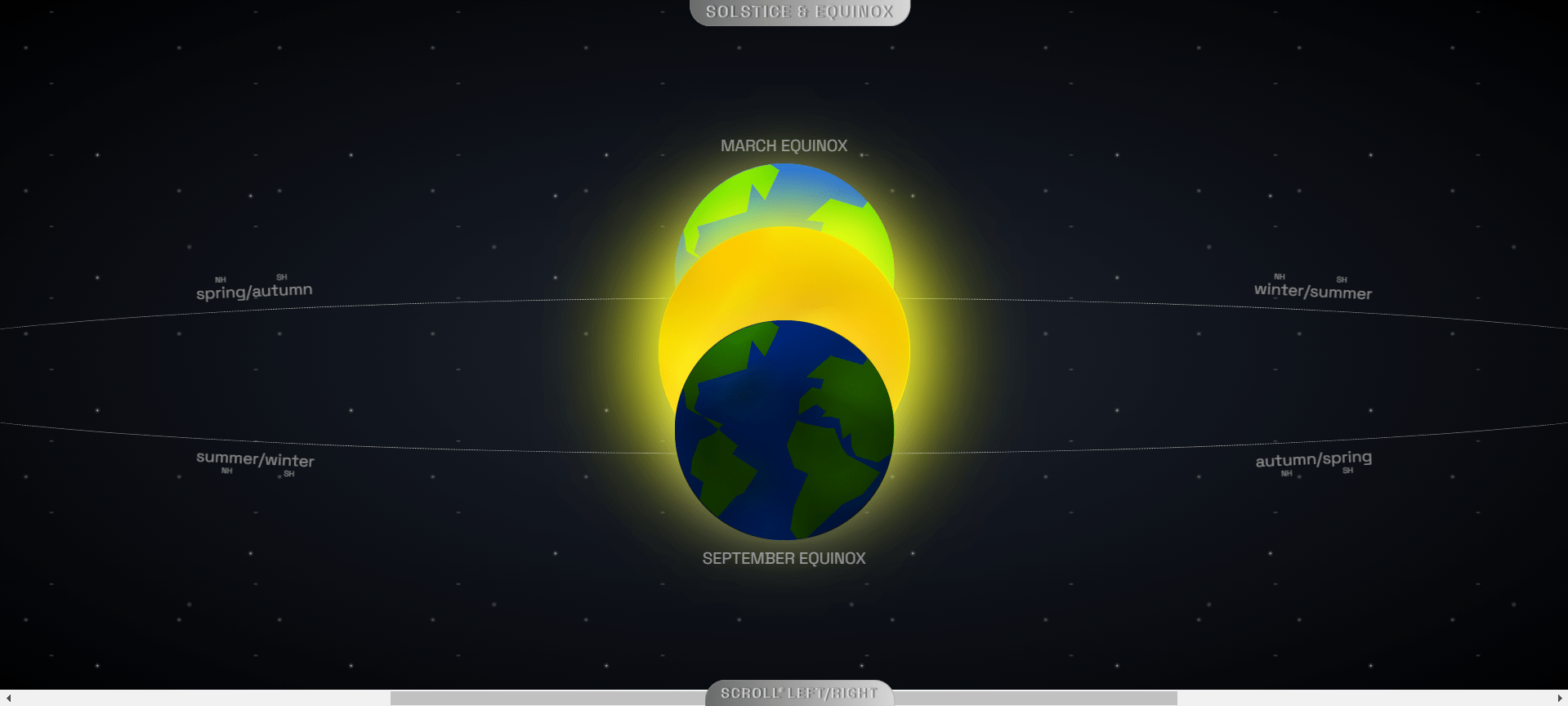
Live Preview Of Solstice and Equinox
See the Pen Solstice & Equinox (Scroll Snap #CodePenChallenge) [pure CSS] by Codewithshobhit (@Codewithshobhit) on CodePen.
Video Preview Of Solstice and Equinox
Conclusion
This HTML code example showcases an engaging and informative way to visually represent the solstices and equinoxes using CSS for styling and scroll effects. By organizing the content into distinct sections and utilizing classes for specific elements like the planet, atmosphere, and continents, the code creates a dynamic and interactive user experience. The inclusion of tags and visual representations ensures that each astronomical event is clearly identified and easily understandable.
Using HTML5 and CSS, this design not only illustrates the occurrences of the June solstice, March equinox, September equinox, and December solstice but also highlights the power of web technologies in presenting scientific concepts in an aesthetically pleasing and accessible manner. By focusing on key elements such as the charset declaration, title, linking of stylesheets, and structured content sections, this example serves as a template for creating educational and visually appealing web pages.
In summary, this HTML and CSS-based representation of solstices and equinoxes demonstrates how web development tools can be effectively used to enhance learning experiences, making complex astronomical events more tangible and engaging for users.