
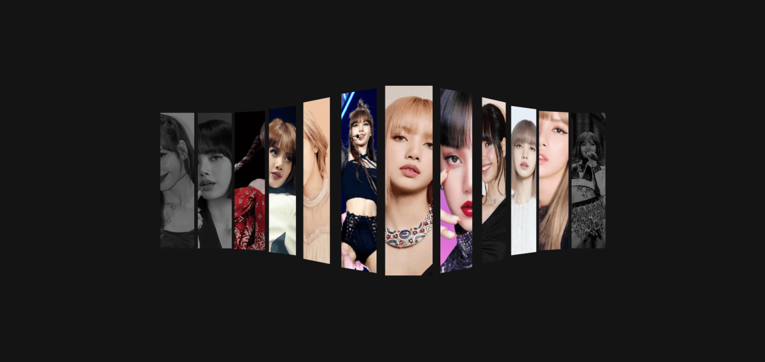
In this article, we will walk through how to create a stunning 3D wave animation effect using HTML and CSS. This interactive animation responds to user actions, creating a smooth transition and depth effect.
Step 1: The HTML Structure
We begin by setting up a basic HTML structure. We use a div container to hold the items we want to animate.
					<!DOCTYPE html>
<html lang="en" >
<head>
  <meta charset="UTF-8">
  <title>3D wave animation</title>
  <link rel="stylesheet" href="./style.css">

</head>
<body>
<div class="wrapper">
  <div class="items">
    <div class="item" tabindex="0" style="background-image: url(https://www.koimoi.com/wp-content/new-galleries/2023/09/blackpinks-lisa-to-sign-new-contract-with-us-record-label-instead-of-yg-entertainment-amid-the-k-pop-girl-groups-uncertain-future-01.jpg)"></div>
    <div class="item" tabindex="0" style="background-image: url(https://hips.hearstapps.com/hmg-prod/images/blackpink-lisa-mac-1603125069.jpg)"></div>
    <div class="item" tabindex="0" style="background-image: url(https://images.lifestyleasia.com/wp-content/uploads/sites/7/2023/09/19125238/Untitled-design-2023-09-19T125008.214-1600x900.jpg)"></div>
    <div class="item" tabindex="0" style="background-image: url(https://images.moneycontrol.com/static-mcnews/2024/05/20240511143651_BLACKPINK%E2%80%99s-Lisa-recalls-her-trainee-days.jpeg?impolicy=website&width=770&height=431)"></div>
    <div class="item" tabindex="0" style="background-image: url(https://cdn.i-scmp.com/sites/default/files/styles/768x768/public/d8/images/methode/2019/03/27/dffa4156-4f80-11e9-8617-6babbcfb60eb_image_hires_141554.JPG?itok=FNC2TjNJ&v=1553667358)"></div>
    <div class="item" tabindex="0" style="background-image: url(https://www.j-14.com/wp-content/uploads/2024/06/blackpink-lisa-comeback.jpg?fit=800%2C690&quality=86&strip=all)"></div>
    <div class="item" tabindex="0" style="background-image: url(https://6.soompi.io/wp-content/uploads/image/20230915072753_blackpink-lisa.jpg?s=900x600&e=t)"></div>
    <div class="item" tabindex="0" style="background-image: url(https://www.tbsnews.net/sites/default/files/styles/big_2/public/images/2023/05/07/blackpinks_lisa_0.png)"></div>
    <div class="item" tabindex="0" style="background-image: url(https://www.rollingstone.com/wp-content/uploads/2024/06/blackpink-lisa-new-single.jpg?w=1581&h=1054&crop=1)"></div>
    <div class="item" tabindex="0" style="background-image: url(https://static1.straitstimes.com.sg/s3fs-public/styles/large30x20/public/articles/2021/09/12/rk_lalisa_120921.jpg?VersionId=RozIxkgRCIusTXDOvqOTW5bmWHcZ.gdH)"></div>
    <div class="item" tabindex="0" style="background-image: url(https://i.pinimg.com/736x/81/17/47/81174792b6da705651848b9205fbb75f.jpg)"></div>
    <div class="item" tabindex="0" style="background-image: url(https://www.j-14.com/wp-content/uploads/2024/02/blackpink-lisa-.jpg?fit=3070%2C2047&quality=86&strip=all)"></div>

    </div>

    </div>


</body>
</html>
Explanation:
.wrapper: A flex container that centers the content on the screen..items: Contains multiple items (images in this case) that will participate in the 3D animation..item: Each item contains a background image that reacts to hover and focus events.
Step 2: The CSS Styling
The magic of the 3D animation happens entirely in the CSS file. We’ll use several CSS properties like perspective, transform, and transition to create the wave effect.
					* {
    margin: 0;
    padding: 0;
    box-sizing: border-box;
}

:root{
    --index: calc(1vw + 1vh);
    --transition: cubic-bezier(.1, .7, 0, 1);
}

body{
    background-color: #141414;
}

.wrapper{
    display: flex;
    align-items: center;
    justify-content: center;
    height: 100vh;
}

.items{
    display: flex;
    gap: 0.4rem;
    perspective: calc(var(--index) * 35);
}

.item{
    width: calc(var(--index) * 3);
    height: calc(var(--index) * 12);
    background-color: #222;
    background-size: cover;
    background-position: center;
    cursor: pointer;
    filter: grayscale(1) brightness(.5);
    transition: transform 1.25s var(--transition), filter 3s var(--transition), width 1.25s var(--transition);
    will-change: transform, filter, rotateY, width;
}

.item::before, .item::after{
    content: '';
    position: absolute;
    height: 100%;
    width: 20px;
    right: calc(var(--index) * -1);
}

.item::after{
    left: calc(var(--index) * -1);
}

.items .item:hover{
    filter: inherit;
    transform: translateZ(calc(var(--index) * 10));
}

/*Right*/

.items .item:hover + *{
    filter: inherit;
    transform: translateZ(calc(var(--index) * 8.5)) rotateY(35deg);
    z-index: -1;
}

.items .item:hover + * + *{
    filter: inherit;
    transform: translateZ(calc(var(--index) * 5.6)) rotateY(40deg);
    z-index: -2;
}

.items .item:hover + * + * + *{
    filter: inherit;
    transform: translateZ(calc(var(--index) * 2.5)) rotateY(30deg);
    z-index: -3;
}

.items .item:hover + * + * + * + *{
    filter: inherit;
    transform: translateZ(calc(var(--index) * .6)) rotateY(15deg);
    z-index: -4;
}


/*Left*/

.items .item:has( + :hover){
    filter: inherit;
    transform: translateZ(calc(var(--index) * 8.5)) rotateY(-35deg);
}

.items .item:has( + * + :hover){
    filter: inherit;
    transform: translateZ(calc(var(--index) * 5.6)) rotateY(-40deg);
}

.items .item:has( + * + * + :hover){
    filter: inherit;
    transform: translateZ(calc(var(--index) * 2.5)) rotateY(-30deg);
}

.items .item:has( + * + * + * + :hover){
    filter: inherit;
    transform: translateZ(calc(var(--index) * .6)) rotateY(-15deg);
}

.items .item:active, .items .item:focus {
	width: 28vw;
	filter: inherit;
	z-index: 100;
	transform: translateZ(calc(var(--index) * 10));
    margin: 0 .45vw;
}
Explanation:
perspective: This creates the depth effect, making the items appear to pop out when hovered over.transform: ThetranslateZproperty allows elements to move along the z-axis, giving the illusion of depth. We also userotateYto slightly rotate neighboring items, creating a wave-like effect.transition: This smoothens the transformation by specifying the duration and easing function.:hover: When you hover over an item, it moves forward, while adjacent items tilt backward or forward to complete the wave.
Step 3: Adding Interactive Elements
We also made the items focusable using the tabindex="0" attribute, so the effect can be triggered with both mouse hover and keyboard navigation.
video Preview Of 3D Wave Animation
Conclusion
Creating a 3D wave animation using just HTML and CSS demonstrates the power and flexibility of modern web technologies. With the right use of CSS properties like perspective, transform, and transition, we can add depth and interactivity to otherwise static web elements, making them visually engaging.
This project not only enhances user experience but also shows how CSS can be leveraged to achieve complex animations without relying on JavaScript. The use of hover effects and keyboard navigation ensures accessibility, making the design functional for all users.
With a little creativity, CSS animations can bring your web pages to life and create an immersive experience for users. Feel free to experiment with additional transitions, different item layouts, or even add custom animations to further enhance your design.
Let’s continue exploring the endless possibilities of CSS!
If you want to master web development from basic to advanced, be sure to check out my e-books for an in-depth guide!

