
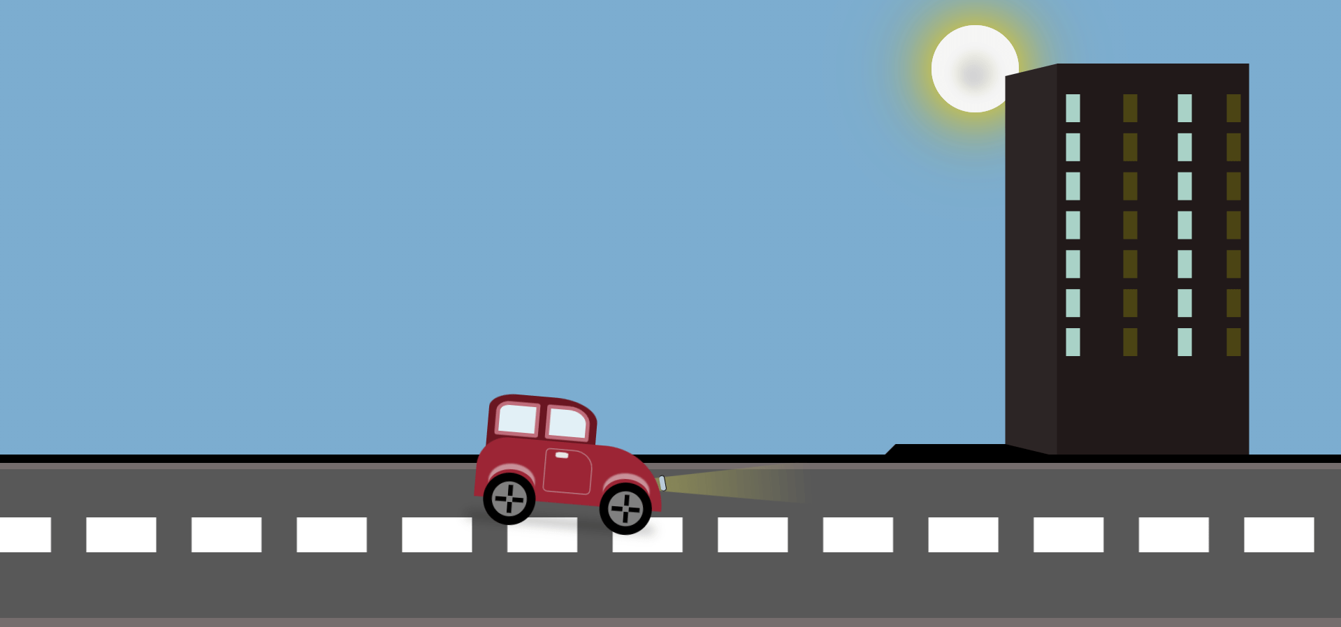
Welcome to the Shobhitdev blog. In this article, we will make a car animation that moves. We will use only HTML and CSS to create the moving car.
A moving car animation is a project where we use CSS to make the car move smoothly. We will use keyframes in CSS to make the car move forward.
Moving Car Animation HTML Code
					<!DOCTYPE html>
<html lang="en" >
<head>
  <meta charset="UTF-8">
  <title>Moving Car Pure CSS bu shobhit asthana</title>
  <link rel="stylesheet" href="./style.css">

</head>
<body>
<!-- partial:index.partial.html -->
<body>
    <div class="moon"></div>

    <div class="skyline">
        <div class="building1-shadow"></div>
        <div class="building1">

            <div class="building-left-half"></div>
            <div class="building-right-half"></div>
        </div>
    </div>
    <div class="road">
        <div class="road-top-half"></div>
        <div class="road-bottom-half"></div>
    </div>

    <div class="car-container">
        <div class="car-top1">
            <div class="window1"></div>
            <div class="window2"></div>

        </div>
        <div class="car-top2">
            <div class="door">
                <div class="door-knob"></div>
            </div>
        </div>
        <div class="car-bottom">
            <div class="wheel1-top"></div>
            <div class="wheel1">
                <div class="wheel-dot1"></div>
                <div class="wheel-dot2"></div>
                <div class="wheel-dot3"></div>
                <div class="wheel-dot4"></div>

            </div>

            <div class="wheel2-top"></div>
            <div class="wheel2">
                <div class="wheel-dot1"></div>
                <div class="wheel-dot2"></div>
                <div class="wheel-dot3"></div>
                <div class="wheel-dot4"></div>
            </div>
        </div>
    </div>


</body>
<!-- partial -->
  <script  src="./script.js"></script>

</body>
</html>
Explanation of Moving Car Animation HTML Code:
DOCTYPE html: This line tells the browser that this is an HTML5 document.
html lang=”en”: This starts the HTML document and sets the language to English.
head: This section contains meta-information about the document, like character set, title, and links to stylesheets.
- meta charset=”UTF-8″: Sets the character encoding to UTF-8, which supports most characters from all the world’s languages.
- title: This sets the title of the web page to “Moving Car Pure CSS by Shobhit Asthana”.
- link rel=”stylesheet” href=”./style.css”: This links to an external CSS file named
style.cssfor styling the web page.
body: This section contains the content of the web page that is visible to users.
div class=”moon”: This creates a div element for the moon.
div class=”skyline”: This creates a div element for the skyline.
- div class=”building1-shadow”: This creates a shadow for the first building.
- div class=”building1″: This creates the first building.
- div class=”building-left-half”: This creates the left half of the building.
- div class=”building-right-half”: This creates the right half of the building.
div class=”road”: This creates a div element for the road.
- div class=”road-top-half”: This creates the top half of the road.
- div class=”road-bottom-half”: This creates the bottom half of the road.
div class=”car-container”: This creates a div element for the car container.
- div class=”car-top1″: This creates the top part of the car.
- div class=”window1″: This creates the first window of the car.
- div class=”window2″: This creates the second window of the car.
- div class=”car-top2″: This creates another part of the car’s top.
- div class=”door”: This creates the door of the car.
- div class=”door-knob”: This creates the door knob of the car.
- div class=”door”: This creates the door of the car.
- div class=”car-bottom”: This creates the bottom part of the car.
div class=”wheel1-top”: This creates the top part of the first wheel.
div class=”wheel1″: This creates the first wheel.
- div class=”wheel-dot1″: These create the dots on the first wheel.
- div class=”wheel-dot2″:
- div class=”wheel-dot3″:
- div class=”wheel-dot4″:
div class=”wheel2-top”: This creates the top part of the second wheel.
div class=”wheel2″: This creates the second wheel.
- div class=”wheel-dot1″: These create the dots on the second wheel.
- div class=”wheel-dot2″:
- div class=”wheel-dot3″:
- div class=”wheel-dot4″:
- div class=”car-top1″: This creates the top part of the car.
script src=”./script.js”: This links to an external JavaScript file named
script.js. This file might contain JavaScript code for the animation./html: This ends the HTML document.
This HTML sets up the structure for a simple web page with a moving car animation. The appearance and animation will be controlled by the linked CSS and JavaScript files.
Moving Car Animation CSS Code
					html {
        box-sizing: border-box;
    }
    *,
    *:before,
    *:after {
        box-sizing: inherit;
    }
body {
    overflow: hidden;
    height: 100vh;
    background: linear-gradient(180deg, #09283d, #1b415c, #29516c, #6e8ea5, #7cadd0, #7cadd0, #7cadd0, #7cadd0, #6e8ea5, #3a6583, #1a4461, #09283d);
    background-size: 2400% 2400%;
    animation: dayNight  15s ease infinite;
    }

@keyframes dayNight {
    0%{background-position:25% 0%}
    50%{background-position:76% 100%}
    100%{background-position:25% 0%}
}
    @keyframes driving {
        0% {
            left: -25%;
        }
        10% {
            bottom: 0%;
        }
        20% {
            transform: scale(0.5) rotateZ(-5deg);
            bottom: 5%
        }
        25% {
            transform: scale(0.5) rotateZ(0deg);
        }
        40% {
            transform: scale(0.5) rotateZ(5deg);
        }
        50% {
            transform: scale(0.5) rotateZ(0deg);
        }
        100% {
            left: 110%;
            bottom: 10%;
            transform: scale(0.5) rotateZ(0deg);
        }
    }
    @keyframes road-moving {
        100% {
            transform: translate(-2400px);
        }
    }
    @keyframes wheelsRotation {
        100% {
            transform: rotate(360deg);
        }
    }
@keyframes moon {
  50% {
    transform: translateY(-20px);
  }
   100% {
    transform: translate(80px, -140px);
  }
}
@keyframes sun-moon {
    from { transform:rotate(0deg); }
    to { transform:rotate(360deg); }
}
    /*   CAR CONTAINER   */

    .car-container {
        position: absolute;
        bottom: -10%;
        width: 430px;
        height: 300px;
        animation: driving 5s infinite linear;
        transform: scale(0.5);
    }
    .car-container:after {
        content: "";
        width: 426px;
        height: 1px;
        margin-top: 88px;
        display: block;
        position: absolute;
        left: -3%;
        z-index: -1;
        bottom: 0;
        box-shadow: 2px -15px 25px 2px #000000;
    }
    /*   WHEELS   */

    .wheel1,
    .wheel2 {
        width: 120px;
        height: 120px;
        background-color: grey;
        border-radius: 50%;
        border: 20px solid black;
        position: absolute;
        bottom: 0;
        animation: wheelsRotation 1s infinite linear;
    }
    .wheel1 {
        left: 5%;
    }
    .wheel1-top,
    .wheel2-top {
        bottom: 48px;
        position: absolute;
        width: 106px;
        height: 80px;
        border-radius: 50%;
        z-index: 5;
        box-shadow: 0px 13px 3px 0px rgba(240, 240, 240, 0.53);
        transform: rotateX(180deg);
    }
    .wheel1-top {
        left: 7%;
    }
    .wheel2-top {
        right: 7%;
    }
    .wheel2 {
        right: 5%;
    }
    .wheel-dot1,
    .wheel-dot2 {
        width: 10px;
        height: 25px;
        background-color: black;
        position: absolute;
    }
    .wheel-dot3,
    .wheel-dot4 {
        width: 25px;
        height: 10px;
        background-color: black;
        position: absolute;
    }
    .wheel-dot1 {
        top: 10%;
        left: 45%;
    }
    .wheel-dot2 {
        bottom: 10%;
        left: 45%;
    }
    .wheel-dot3 {
        top: 45%;
        right: 10%;
    }
    .wheel-dot4 {
        top: 45%;
        left: 10%;
    }
    .door {
        width: 110px;
        height: 100px;
        border: 3px solid #B57A84;
        position: absolute;
        left: 36%;
        top: 16px;
        border-radius: 10% 40% 10% 10%;
    }
    .door-knob {
        width: 30px;
        height: 14px;
        background-color: #E8E6E6;
        border-radius: 30%;
        position: absolute;
        left: 20%;
        top: 5%;
        border: 1px solid lightcoral;
    }
    .car-top1 {
        border-radius: 25% 40% 0 0;
        background-color: #6A1621;
        max-width: 100%;
        width: 250px;
        height: 130px;
        position: absolute;
        top: 0;
        left: 4%;
    }
    .window1,
    .window2 {
        background-color: #E2F0F6;
        border-radius: 5px;
        position: absolute;
        width: 40%;
        height: 60%;
        margin: 17px;
        border: 9px solid #BF6D7B;
    }
    .window1 {
        left: 0;
        border-top-left-radius: 30%;
    }
    .window2 {
        right: 0;
        border-top-right-radius: 50%;
    }
    .car-top2 {
        border-radius: 100px 200px 0 0;
        background-color: #25659C;
        */ border: 10px solid #72252F;
        background-color: #9C2535;
        max-width: 100%;
        width: 430px;
        height: 140px;
        position: absolute;
        bottom: 20%;
    }
    .road {
        width: 250%;
        height: 200px;
        background-color: #585858;
        border-top: 10px solid #756D6D;
        border-bottom: 20px solid #756D6D;
        position: absolute;
        bottom: 0%;
        margin-left: -10px;
        padding: 0;
    }
    .road::before {
        content: " ";
        position: absolute;
        z-index: 0;
        top: -17px;
        left: 0px;
        right: 0px;
        border: 5px solid black;
    }
    .road-top-half {
        height: 15px;
        width: 250%;
        position: absolute;
        left: -10%;
        top: 30px;
        border-top: 40px dashed white;
        margin-top: 25px;
        animation: road-moving 10s infinite linear;
        transition: all 3s linear;
    }
    .skyline {
        width: 100%;
        position: absolute;
        bottom: 205px;
        padding: 0;
        left: 110%;
        animation: road-moving 10s infinite linear;
        transition: all 8s linear;
    }
    .building1 {
        width: 220px;
        height: 450px;
        background-color: #211919;
        position: relative;
    }
    .building1-shadow {
        border-top: 15px solid transparent;
        border-right: 60px solid rgb(44, 37, 37);
        border-bottom: 15px solid #000;
        border-left: 15px solid transparent;
        height: 450px;
        width: 200px;
        position: absolute;
        left: -199px;
    }
    .building-left-half,
    .building-right-half {
        height: 300px;
        width: 50px;
        position: absolute;
        top: 10px;
        border-left: 16px dashed #A9D2C7;
        border-right: 16px dashed rgba(255, 255, 0, 0.19);
        margin-top: 25px;
    }
    .building-left-half {
        left: 10px;
        padding: 25px;
    }
    .building-right-half {
        right: 10px;
        padding: 20px;
    }
    .moon {
        height: 100px;
        width: 100px;
        border-radius: 50%;
        background: rgb(207, 207, 212);
        margin: auto;
        box-shadow: 0 0 60px gold, 0 0 100px rgb(185, 160, 24), inset 0 5px 12px 26px #F5F5F5, inset -2px 8px 15px 36px #E6E6DB;
        transition: 1s;
        transition: 1s;
        right:370px;
        top: 30px;
        position: absolute;
        animation: sun-moon 40s  2s linear infinite;
        transform-origin: 50% 500px;
    }

/*Headlights*/
.car-top1:after {
    width: 13px;
    height: 37px;
    background-color: #BACCDA;
    position: absolute;
    bottom: -63px;
    right: -168px;
    z-index: 10;
    content: " ";
    border-radius: 10px;
    border: 2px solid black;
    border-left-style: none;
    transform: rotate(-15deg);
}

    .car-top2:after {
    position: absolute;
    bottom: 7px;
    right: -340px;
    content: " ";
    width: 0;
    height: 0;
    border-top: 20px solid transparent;
    border-bottom: 80px solid transparent;
    border-right: 500px solid rgba(191,188,87,0.7);
    z-index: -1;
    -webkit-mask-box-image: -webkit-linear-gradient(left, black, transparent);
    -webkit-mask-box-image: -o-linear-gradient(left, black, transparent);
    -webkit-mask-box-image: linear-gradient(to right, black, transparent);
    transform: rotate(-9deg);
    }
Explanation of Moving Car Animation CSS Code:
The provided CSS code sets up animations and styles for a web page featuring a moving car against a dynamic background.
General Styles: Establishes global styles such as box-sizing and body background.
Keyframes for Animations: Defines keyframes for various animations like the background cycle (day to night effect), car driving motion, road movement, wheel rotation, and moon movement.
Car Container and Components: Positions and styles the car container, wheels, door, and car body parts.
Road and Skyline: Styles the road, including its appearance and movement, and creates a skyline with buildings and shadows, also animating their movement.
Overall, this CSS code creates a visually engaging scene with a moving car driving along a dynamic road against a changing day-night background.
