
Hey there, You are most welcome to this article. Today we are going to create a Responsive Navbar with sidebar animation. I hope you will enjoy this article. If you like this article then please share this article with your friends and colleagues. If you have any questions or suggestions regarding this article then please comment down below.
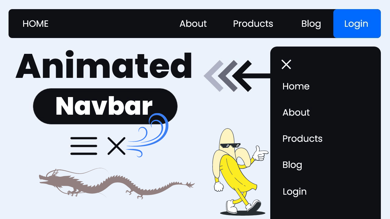
To create the basic structure of a website, you’ll need to create six files: index.html, about.html, blog.html, product.html, login.html, and style.css.
Responsive Navbar HTML Code
index.html
<!DOCTYPE html>
<html lang="en">
<head>
<meta charset="UTF-8">
<meta name="viewport" content="width=device-width, initial-scale=1.0">
<title>Animated Navbar</title>
<link rel="stylesheet" href="style.css">
</head>
<body>
<nav>
<input type="checkbox" id="sidebar-active">
<label for="sidebar-active" class="open-sidebar-button">
<svg xmlns="http://www.w3.org/2000/svg" height="32" viewBox="0 -960 960 960" width="32"><path d="M120-240v-80h720v80H120Zm0-200v-80h720v80H120Zm0-200v-80h720v80H120Z"/></svg>
</label>
<label id="overlay" for="sidebar-active"></label>
<div class="links-container">
<label for="sidebar-active" class="close-sidebar-button">
<svg xmlns="http://www.w3.org/2000/svg" height="32" viewBox="0 -960 960 960" width="32"><path d="m256-200-56-56 224-224-224-224 56-56 224 224 224-224 56 56-224 224 224 224-56 56-224-224-224 224Z"/></svg>
</label>
<a class="home-link" href="index.html">Home</a>
<a href="about.html">About</a>
<a href="products.html">Products</a>
<a href="blog.html">Blog</a>
<a href="login.html">Login</a>
</div>
</nav>
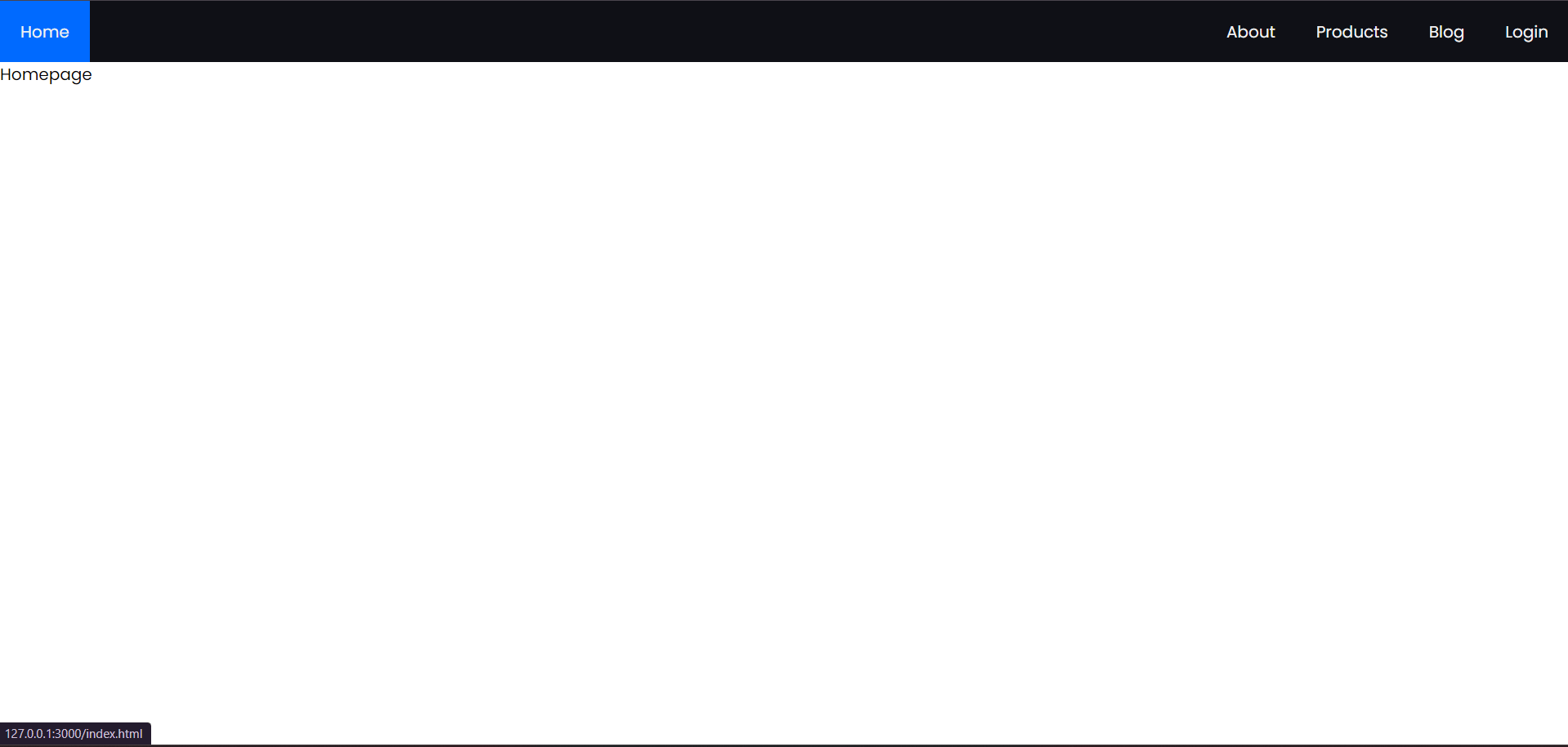
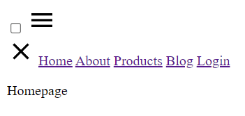
<p>Homepage</p>
</body>
</html>
After adding CSS, this page will look like this. We’ll include the CSS in the next section. To view the CSS code, simply scroll down.
The index.html file serves as the homepage of a website. Let’s break down its components:
– <!DOCTYPE html>: This declaration specifies that the document type is HTML5.
– <html lang=”en”>: The opening tag for the HTML document, specifying that the content is in English.
– <head>: This section contains metadata and links to external resources.
– <meta charset=”UTF-8″>: Specifies the character encoding for the document as UTF-8.
– <meta name=”viewport” content=”width=device-width, initial-scale=1.0″>: Sets the viewport properties for responsive design.
– <title>Animated Navbar</title>: Sets the title of the webpage.
– <link rel=”stylesheet” href=”style.css”>: Links an external CSS file named style.css to apply styles to the HTML elements.
– <body>: This section contains the visible content of the webpage.
– <nav>: Defines a navigation section for the webpage.
– <input type=”checkbox” id=”sidebar-active”>: A checkbox input element used for toggling the visibility of the sidebar.
– <label for=”sidebar-active” class=”open-sidebar-button”>: A label associated with the checkbox to activate the sidebar when clicked.
– <svg>: An SVG image used as an icon for opening the sidebar.
– <label id=”overlay” for=”sidebar-active”></label>: An empty label used as an overlay to cover the content when the sidebar is active.
– <div class=”links-container”>: A container for navigation links and buttons.
– <label for=”sidebar-active” class=”close-sidebar-button”>: A label used as a button to close the sidebar when clicked.
– <svg>: Another SVG icon used as a close button.
– <a>: Anchor elements representing navigation links to different pages (Home, About, Products, Blog, Login). The Home link is marked with the class “home-link”.
– <p>Homepage</p>: A paragraph element displaying the text “Homepage”, which serves as the main content of the homepage.
This index.html file creates a basic structure for a homepage with a navigation bar and some placeholder content. The navigation links allow users to navigate to other pages of the website.
about.html
					<!DOCTYPE html>
<html lang="en">
<head>
  <meta charset="UTF-8">
  <meta name="viewport" content="width=device-width, initial-scale=1.0">
  <title>About</title>
  <link rel="stylesheet" href="style.css">
</head>
<body>
  <nav>
    <input type="checkbox" id="sidebar-active">
    <label for="sidebar-active" class="open-sidebar-button">
      <svg xmlns="http://www.w3.org/2000/svg" height="32" viewBox="0 -960 960 960" width="32"><path d="M120-240v-80h720v80H120Zm0-200v-80h720v80H120Zm0-200v-80h720v80H120Z"/></svg>
    </label>
    <label id="overlay" for="sidebar-active"></label>
    <div class="links-container">
      <label for="sidebar-active" class="close-sidebar-button">
        <svg xmlns="http://www.w3.org/2000/svg" height="32" viewBox="0 -960 960 960" width="32"><path d="m256-200-56-56 224-224-224-224 56-56 224 224 224-224 56 56-224 224 224 224-56 56-224-224-224 224Z"/></svg>
      </label>

      <a class="home-link" href="index.html">Home</a> <!-- link back to homepage -->
      <a href="about.html">About</a>
      <a href="products.html">Products</a>
      <a href="blog.html">Blog</a>
      <a href="login.html">Login</a>

    </div>
  </nav>

  <p>About</p>
</body>
</html>
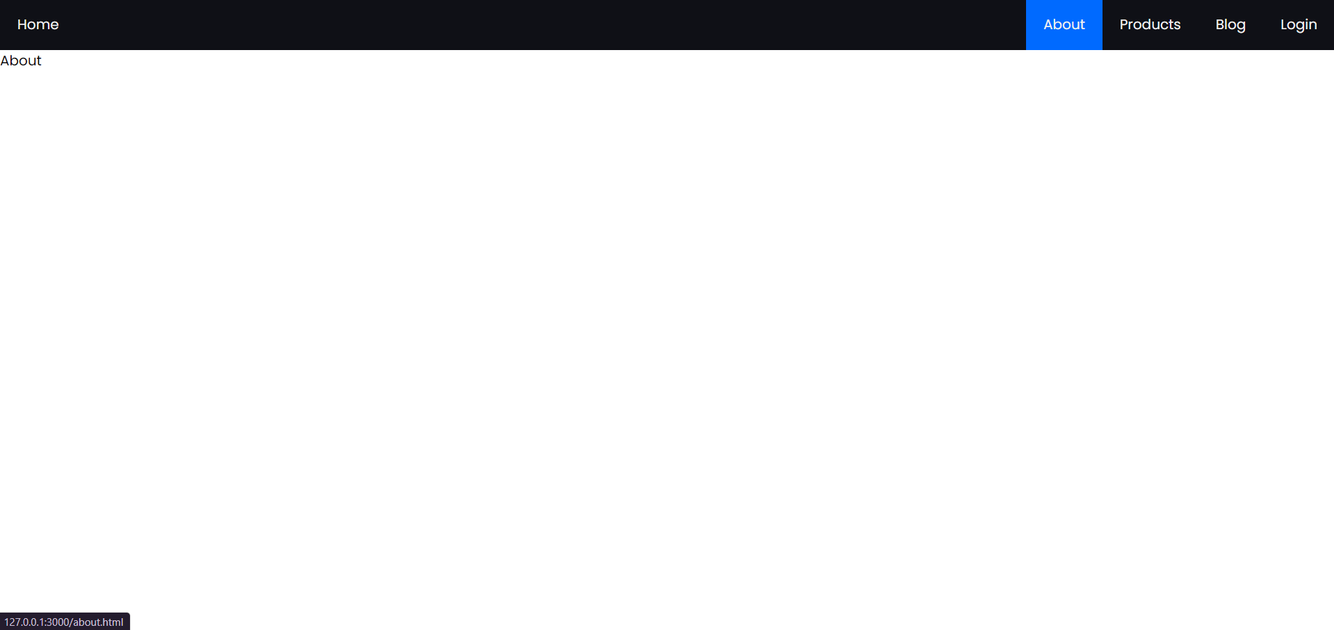
After adding CSS, this page will look like this. We’ll include the CSS in the next section. To view the CSS code, simply scroll down.
blog.html
					<!DOCTYPE html>
<html lang="en">
<head>
  <meta charset="UTF-8">
  <meta name="viewport" content="width=device-width, initial-scale=1.0">
  <title>Blog</title>
  <link rel="stylesheet" href="style.css">
</head>
<body>
  <nav>
    <input type="checkbox" id="sidebar-active">
    <label for="sidebar-active" class="open-sidebar-button">
      <svg xmlns="http://www.w3.org/2000/svg" height="32" viewBox="0 -960 960 960" width="32"><path d="M120-240v-80h720v80H120Zm0-200v-80h720v80H120Zm0-200v-80h720v80H120Z"/></svg>
    </label>
    <label id="overlay" for="sidebar-active"></label>
    <div class="links-container">
      <label for="sidebar-active" class="close-sidebar-button">
        <svg xmlns="http://www.w3.org/2000/svg" height="32" viewBox="0 -960 960 960" width="32"><path d="m256-200-56-56 224-224-224-224 56-56 224 224 224-224 56 56-224 224 224 224-56 56-224-224-224 224Z"/></svg>
      </label>

      <a class="home-link" href="index.html">Home</a> <!-- link back to homepage -->
      <a href="about.html">About</a>
      <a href="products.html">Products</a>
      <a href="blog.html">Blog</a>
      <a href="login.html">Login</a>

    </div>
  </nav>
  <p>Blog</p>
</body>
</html>
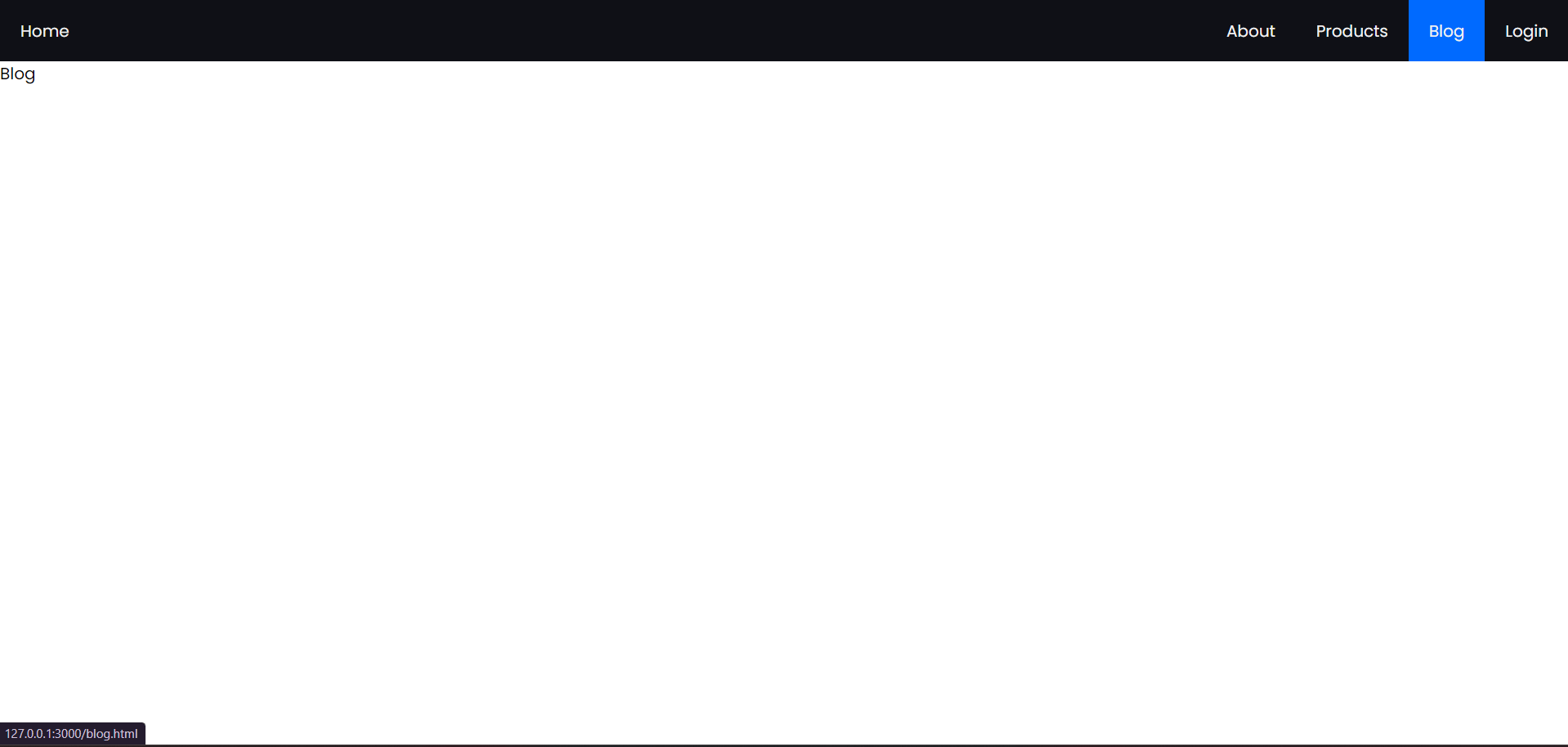
After adding CSS, this page will look like this. We’ll include the CSS in the next section. To view the CSS code, simply scroll down.
product.html
					<!DOCTYPE html>
<html lang="en">
<head>
  <meta charset="UTF-8">
  <meta name="viewport" content="width=device-width, initial-scale=1.0">
  <title>Products</title>
  <link rel="stylesheet" href="style.css">
</head>
<body>
  <nav>
    <input type="checkbox" id="sidebar-active">
    <label for="sidebar-active" class="open-sidebar-button">
      <svg xmlns="http://www.w3.org/2000/svg" height="32" viewBox="0 -960 960 960" width="32"><path d="M120-240v-80h720v80H120Zm0-200v-80h720v80H120Zm0-200v-80h720v80H120Z"/></svg>
    </label>
    <label id="overlay" for="sidebar-active"></label>
    <div class="links-container">
      <label for="sidebar-active" class="close-sidebar-button">
        <svg xmlns="http://www.w3.org/2000/svg" height="32" viewBox="0 -960 960 960" width="32"><path d="m256-200-56-56 224-224-224-224 56-56 224 224 224-224 56 56-224 224 224 224-56 56-224-224-224 224Z"/></svg>
      </label>

      <a class="home-link" href="index.html">Home</a> <!-- link back to homepage -->
      <a href="about.html">About</a>
      <a href="products.html">Products</a>
      <a href="blog.html">Blog</a>
      <a href="login.html">Login</a>

    </div>
  </nav>
  <p>Products</p>
</body>
</html>
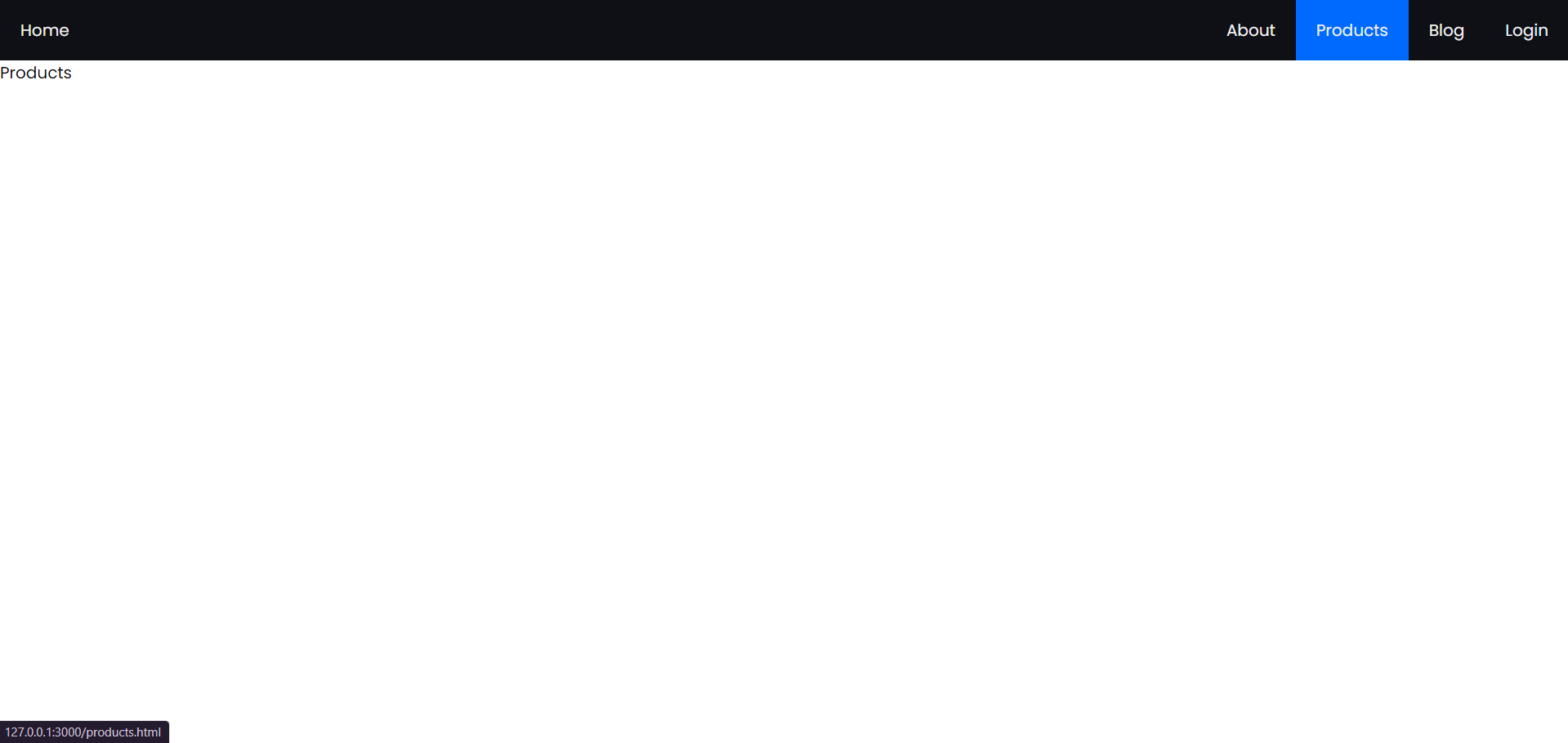
After adding CSS, this page will look like this. We’ll include the CSS in the next section. To view the CSS code, simply scroll down.
login.html
					<!DOCTYPE html>
<html lang="en">
<head>
  <meta charset="UTF-8">
  <meta name="viewport" content="width=device-width, initial-scale=1.0">
  <title>Login</title>
  <link rel="stylesheet" href="style.css">
</head>
<body>
  <nav>
    <input type="checkbox" id="sidebar-active">
    <label for="sidebar-active" class="open-sidebar-button">
      <svg xmlns="http://www.w3.org/2000/svg" height="32" viewBox="0 -960 960 960" width="32"><path d="M120-240v-80h720v80H120Zm0-200v-80h720v80H120Zm0-200v-80h720v80H120Z"/></svg>
    </label>
    <label id="overlay" for="sidebar-active"></label>
    <div class="links-container">
      <label for="sidebar-active" class="close-sidebar-button">
        <svg xmlns="http://www.w3.org/2000/svg" height="32" viewBox="0 -960 960 960" width="32"><path d="m256-200-56-56 224-224-224-224 56-56 224 224 224-224 56 56-224 224 224 224-56 56-224-224-224 224Z"/></svg>
      </label>

      <a class="home-link" href="index.html">Home</a> <!-- link back to homepage -->
      <a href="about.html">About</a>
      <a href="products.html">Products</a>
      <a href="blog.html">Blog</a>
      <a href="login.html">Login</a>

    </div>
  </nav>

  <p>Login</p>
</body>
</html>
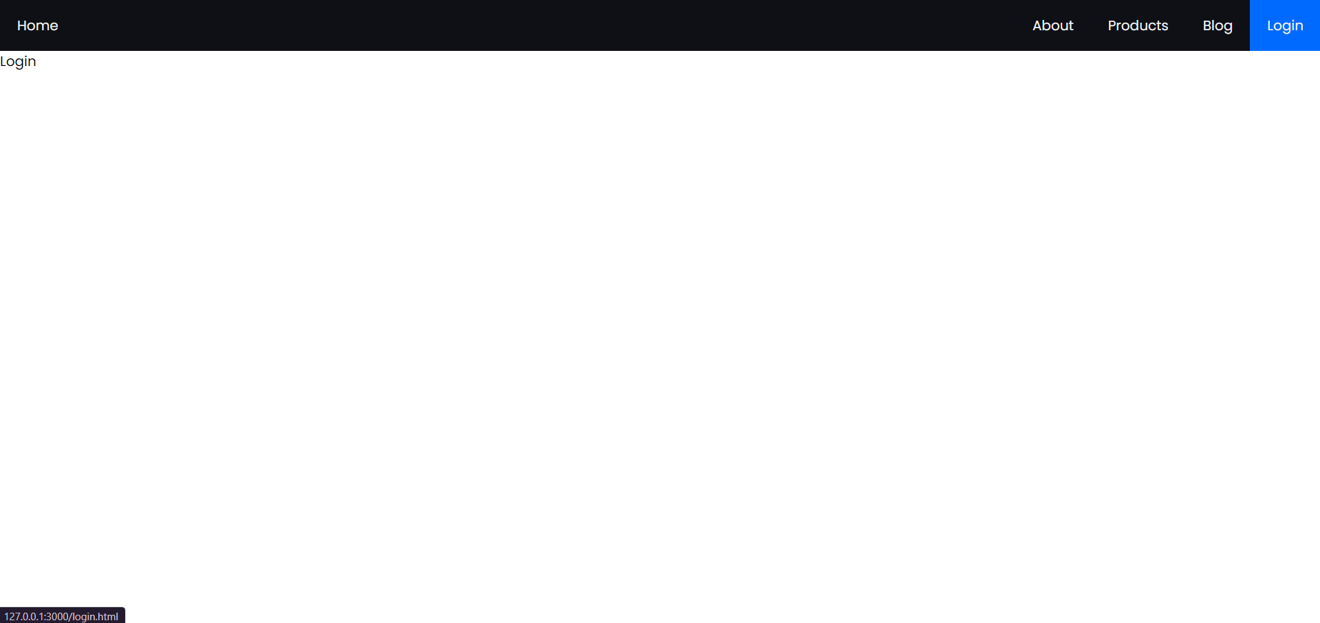
Here we have the output for the above code, it doesn’t consist of CSS as we will do that in the next part given below
Responsive Navbar CSS Code
style.css
					@import url('https://fonts.googleapis.com/css2?family=Poppins:ital,wght@0,100;0,200;0,300;0,400;0,500;0,600;0,700;0,800;0,900;1,100;1,200;1,300;1,400;1,500;1,600;1,700;1,800;1,900&display=swap');
:root{
  --color-1: #0f1016;
  --text-color: #f0f0f0;
  --accent-color: #006aff;
}
*{
  margin: 0;
  padding: 0;
}
html{
  font-size: 12pt;
  font-family: Poppins, Segoe UI, Tahoma, sans-serif;
}
nav{
  height: 60px;
  background-color: var(--color-1);
  display: flex;
  justify-content: flex-end;
  align-items: center;
}
.links-container{
  height: 100%;
  width: 100%;
  display: flex;
  flex-direction: row;
  align-items: center;
}
nav a{
  height: 100%;
  padding: 0 20px;
  display: flex;
  align-items: center;
  text-decoration: none;
  color: var(--text-color);
}
nav a:hover{
  background-color: var(--accent-color);
}
nav .home-link{
  margin-right: auto;
}
nav svg{
  fill: var(--text-color);
}
#sidebar-active{
  display: none;
}
.open-sidebar-button, .close-sidebar-button{
  display: none;
}
@media(max-width: 450px){
  .links-container{
    flex-direction: column;
    align-items: flex-start;

    position: fixed;
    top: 0;
    right: -100%;
    z-index: 10;
    width: 300px;

    background-color: var(--color-1);
    box-shadow: -5px 0 5px rgba(0, 0, 0, 0.25);
    transition: 0.75s ease-out;
  }
  nav a{
    box-sizing: border-box;
    height: auto;
    width: 100%;
    padding: 20px 30px;
    justify-content: flex-start;
  }
  .open-sidebar-button, .close-sidebar-button{
    padding: 20px;
    display: block;
  }
  #sidebar-active:checked ~ .links-container{
    right: 0;
  }
  #sidebar-active:checked ~ #overlay{
    height: 100%;
    width: 100%;
    position: fixed;
    top: 0;
    left: 0;
    z-index: 9;
  }
}
This CSS code is responsible for styling the webpage, including defining colors, fonts, layout, and behavior. Let’s break it down:
@import url(‘https://fonts.googleapis.com/css2?family=Poppins:ital,wght@0,100;0,200;0,300;0,400;0,500;0,600;0,700;0,800;0,900;1,100;1,200;1,300;1,400;1,500;1,600;1,700;1,800;1,900&display=swap’);
This line imports the Google Fonts stylesheet for the font family “Poppins” with various font weights and styles.
:root{
–color-1: #0f1016;
–text-color: #f0f0f0;
–accent-color: #006aff;
}
Defines CSS variables for colors used throughout the document.
*{
margin: 0;
padding: 0;
}
Resets default margin and padding for all elements.
html{
font-size: 12pt;
font-family: Poppins, Segoe UI, Tahoma, sans-serif;
}
Sets the base font size and font family for the HTML document.
nav{
/* styles for navigation bar */
}
Styles for the navigation bar.
.links-container{
/* styles for the container of navigation links */
}
Styles for the container of navigation links.
nav a{
/* styles for navigation links */
}
Styles for navigation links.
@media(max-width: 450px){
/* media query for smaller screens */
}
Media query targeting screens with a maximum width of 450px.
The CSS within the media query adjusts the layout and behavior of elements for smaller screens, primarily focusing on the navigation links and sidebar activation button. It transforms the navigation links into a vertical list and enables a sidebar toggle button functionality for mobile devices.

