
Introduction
Creating a dynamic and engaging user experience on your website can be as simple as adding a bouncy image slider. This tutorial will guide you through creating a stylish and animated image slider using just HTML and CSS.
In the world of web development, creating interactive and engaging user experiences is key to capturing and retaining visitors’ attention. One popular way to achieve this is through image sliders. Image sliders can showcase multiple images in a compact space and often include dynamic transitions to keep users engaged. In this tutorial, we’ll demonstrate how to create a bouncy image slider using HTML and CSS. This slider will not only display images but also provide a smooth and lively animation when switching between images.
Project Overview
What is a Bouncy Image Slider?
A bouncy image slider is an advanced type of image carousel that includes animated transitions to make the sliding effect more dynamic and appealing. Unlike static sliders, the bouncy image slider incorporates smooth and lively animations, providing a more engaging user experience.
How It Works
The project uses a combination of HTML for structure and CSS for styling and animation. Here’s a quick rundown of how it works:
- HTML: Defines the structure of the slider, including the images and radio buttons used to switch between images.
- CSS: Handles the styling of the slider and implements the animation effects. CSS Grid is used to layout the images, and CSS transitions create the bouncy effect when images are selected.
Uses and Applications
Bouncy image sliders are versatile and can be used in various applications, including:
- Portfolio Websites: Showcase a series of images, such as photographs or design works, in an interactive and appealing manner.
- E-commerce Sites: Display product images dynamically, making it easier for customers to view different products or product angles.
- Blogs and Articles: Enhance visual storytelling by adding animated image galleries to blog posts or articles.
- Marketing Pages: Highlight key features or benefits with animated images to capture users’ attention and convey information more effectively.
Benefits
- Engagement: The animation effects keep users engaged and interested.
- Space-saving: Multiple images can be displayed in a compact area, making efficient use of screen space.
- Enhanced User Experience: Smooth transitions and responsive design improve the overall user experience.
By the end of this tutorial, you’ll have a fully functional bouncy image slider that can be customized and integrated into your web projects to enhance visual appeal and user interaction.
HTML Code
<!DOCTYPE html>
<html lang="en" >
<head>
<meta charset="UTF-8">
<title>Bouncy image radio group</title>
<meta name="viewport" content="width=device-width, initial-scale=1"><link rel="stylesheet" href="./style.css">
</head>
<body>
<fieldset>
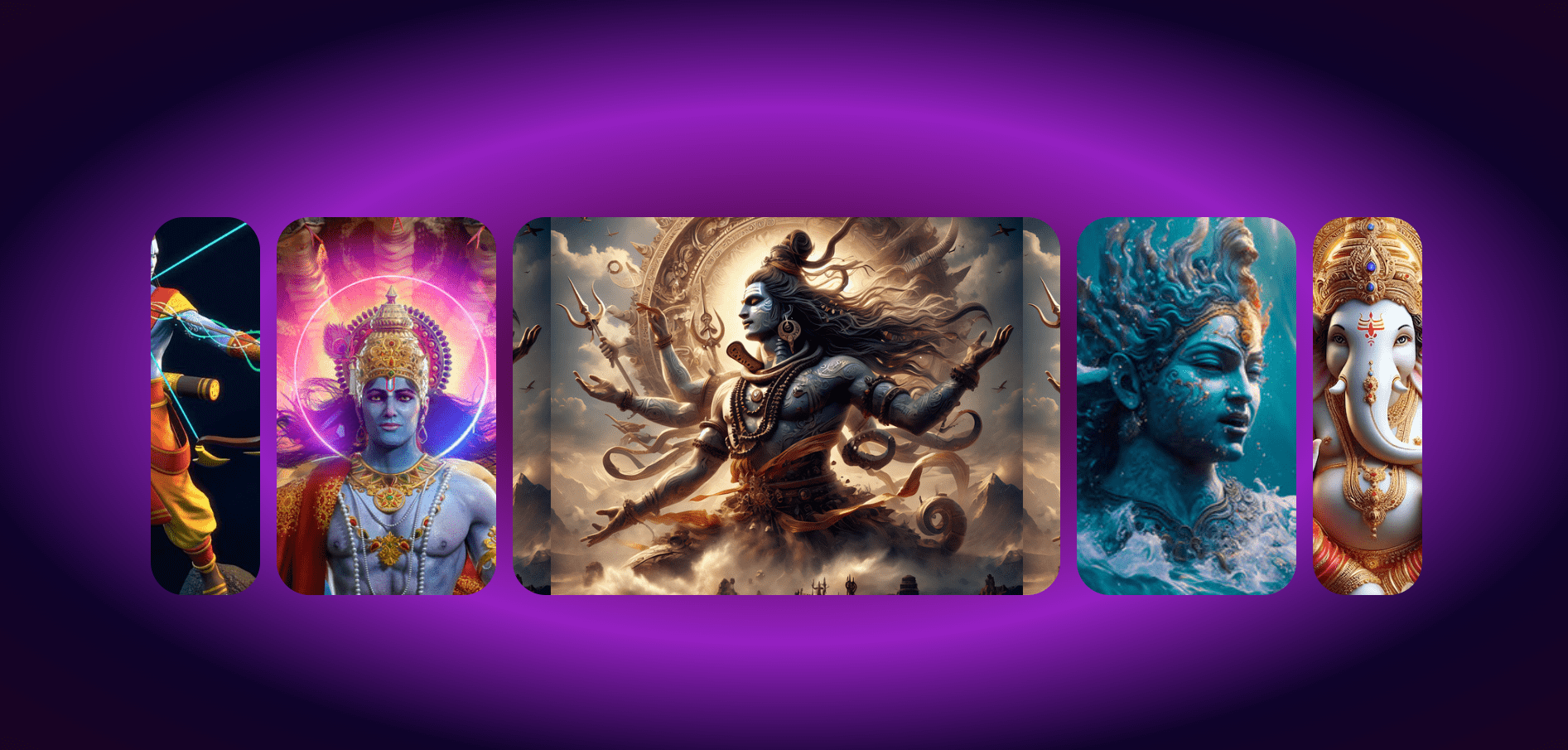
<label style="--_img: url(https://www.jokesinhindishayari.com/wallpapers-src/god-ram-3d-wallpaper/9bc709f2130e59029a8061a7715a0349.jpg)">
<input type="radio" name="images" value="Jai Shree Ram">
</label>
<label style="--_img: url(https://d2jnu6hkti1tqv.cloudfront.net/upload/7055be07-5cdd-4abb-8bfb-76a4562924bd.jpg)">
<input type="radio" name="images" value="Pink Princess">
</label>
<label style="--_img: url(https://cdn.pixabay.com/photo/2024/02/08/03/45/ai-generated-8560118_640.png)">
<input type="radio" name="images" value="Monstera" checked>
</label>
<label style="--_img: url(https://t4.ftcdn.net/jpg/05/54/24/09/360_F_554240992_kx5rRzhEySBQF3yAgOv0OUMGHK7FarcP.jpg)">
<input type="radio" name="images" value="Pothos">
</label>
<label style="--_img: url(https://img.freepik.com/premium-photo/lord-ganesh-jee_1153477-894.jpg)">
<input type="radio" name="images" value="Rubber Tree">
</label>
</fieldset>
</body>
</html>
Explaining the HTML Code
The provided HTML code creates a bouncy image slider using a set of radio buttons and labels. The structure is defined within an HTML document starting with the `<!DOCTYPE html>` declaration, which specifies the HTML version. The `<html lang=”en”>` tag indicates that the content is in English. Inside the `<head>` section, meta tags set the character encoding to UTF-8 and specify the viewport settings for responsive design. The title of the document is set to “Bouncy image radio group”, and an external CSS stylesheet named “style.css” is linked for styling.
In the `<body>` section, a `<fieldset>` element contains a group of `<label>` elements, each representing an image option in the slider. Each `<label>` is styled with a background image set through an inline CSS custom property `–_img`. Inside each label, a hidden `<input>` element of type “radio” allows users to select the corresponding image. The `name` attribute of these radio buttons is set to “images”, grouping them together so only one can be selected at a time. The `value` attribute provides a description for each image, and one radio button is pre-selected using the `checked` attribute.
This setup allows for a visually engaging image slider where selecting a radio button changes the displayed image. The labels act as clickable areas, and the associated CSS will handle the styling and animation of the images.
CSS Code
					@import "https://unpkg.com/open-props" layer(design.system);

@layer demo {
  fieldset {
    grid-template-columns:
      var(--col-1, 1fr)
      var(--col-2, 1fr)
      var(--col-3, 1fr)
      var(--col-4, 1fr)
      var(--col-5, 1fr)
    ;

    @media (prefers-reduced-motion: no-preference) {
      transition: grid-template-columns 2s var(--ease-spring-5);
    }

    &:has(label:nth-child(1) > input:checked) {
      --col-1: 5fr;
      --col-2: 3fr;
    }
    &:has(label:nth-child(2) > input:checked) {
      --col-1: 2fr;
      --col-2: 5fr;
      --col-3: 2fr;
    }
    &:has(label:nth-child(3) > input:checked) {
      --col-2: 2fr;
      --col-3: 5fr;
      --col-4: 2fr;
    }
    &:has(label:nth-child(4) > input:checked) {
      --col-3: 2fr;
      --col-4: 5fr;
      --col-5: 2fr;
    }
    &:has(label:nth-child(5) > input:checked) {
      --col-4: 3fr;
      --col-5: 5fr;
    }

    > label {
      background-image: var(--_img);
      background-position: center;
      background-size: auto 125%;
    }
  }
}

@layer demo.support {
  html {
    background: repeating-radial-gradient(rgb(35, 15, 65), rgb(86, 11, 85), rgb(148, 33, 194), rgb(15, 3, 43), rgb(27, 3, 34));
    block-size: 100%;
  }

  body {
    min-block-size: 100%;
    display: grid;
    place-content: center;
    padding: var(--size-5);
    gap: var(--size-5);
  }

  fieldset {
    inline-size: 80vw;

    display: grid;
    grid-auto-flow: column;
    grid-template-rows: 50vh;
    gap: var(--size-3);
    border: none;

    > label {
      cursor: pointer;
      border-radius: var(--radius-4);

      &:focus-within {
        outline: 1px solid green;
        outline-offset: 5px;
      }

      > input {
        opacity: 0;
      }
    }
  }
}
Explaining the CSS Code
The provided CSS code is designed to create and animate a bouncy image slider using modern CSS features like custom properties, CSS Grid, and layered styling. Initially, the code imports Open Props, which provides a set of design tokens to ensure consistent styling across the project. Within the main styling layer, the `fieldset` is defined as a CSS Grid container with five columns, each set to one fraction of the available space by default. The `@media` query checks if the user does not prefer reduced motion and, if so, enables smooth transitions for the grid-template-columns property over 2 seconds.
The code dynamically adjusts the grid columns based on which radio input is checked using the `:has()` pseudo-class, creating the bouncy effect where the selected image’s column expands while adjacent columns contract. Each `label` within the `fieldset` is styled with a background image, centered and scaled appropriately. The supportive styling layer adds further enhancements, including a visually appealing repeating radial gradient background for the HTML element and grid-centered content within the body, ensuring the content is displayed neatly in the middle of the viewport.
The `fieldset` within the body is styled to occupy 80% of the viewport’s width and display its children as columns with a single row, with gaps between the columns and no border. Labels within the `fieldset` are made clickable with rounded corners and a focus outline, while the radio input elements are hidden by setting their opacity to zero. This comprehensive approach ensures a visually engaging and interactive image slider that is both flexible and dynamic, leveraging the power of CSS Grid and transitions for a polished user experience.
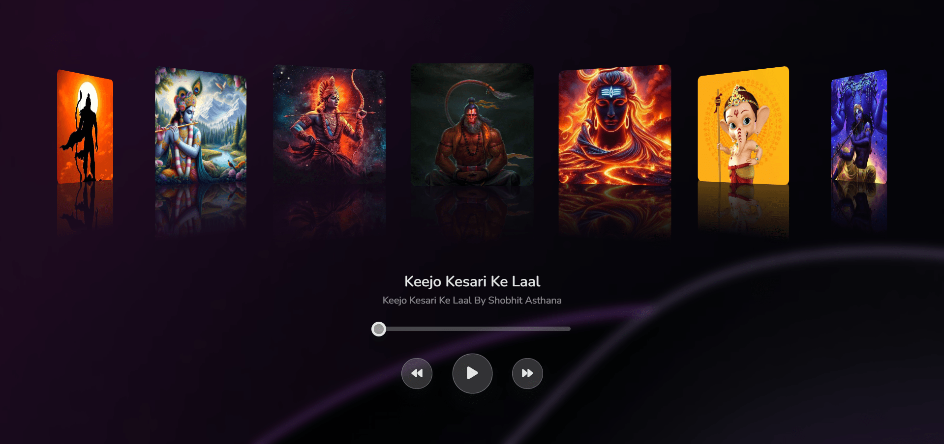
Bouncy Image Slider Live Preview
See the Pen Bouncy image radio group by Codewithshobhit (@Codewithshobhit) on CodePen.
Conclusion
Creating a bouncy image slider using HTML and CSS is an effective way to enhance the visual appeal and interactivity of your web projects. By leveraging modern CSS features such as CSS Grid, custom properties, and transitions, you can create a dynamic and responsive image slider that captivates users. This slider not only showcases images in an engaging manner but also provides smooth and lively animations that improve the overall user experience. Whether for portfolio websites, e-commerce platforms, blogs, or marketing pages, a bouncy image slider is a versatile and powerful tool that can make your content more appealing and interactive. By following this tutorial, you can easily implement and customize this slider to fit your specific needs, adding a touch of elegance and interactivity to your web projects.

