
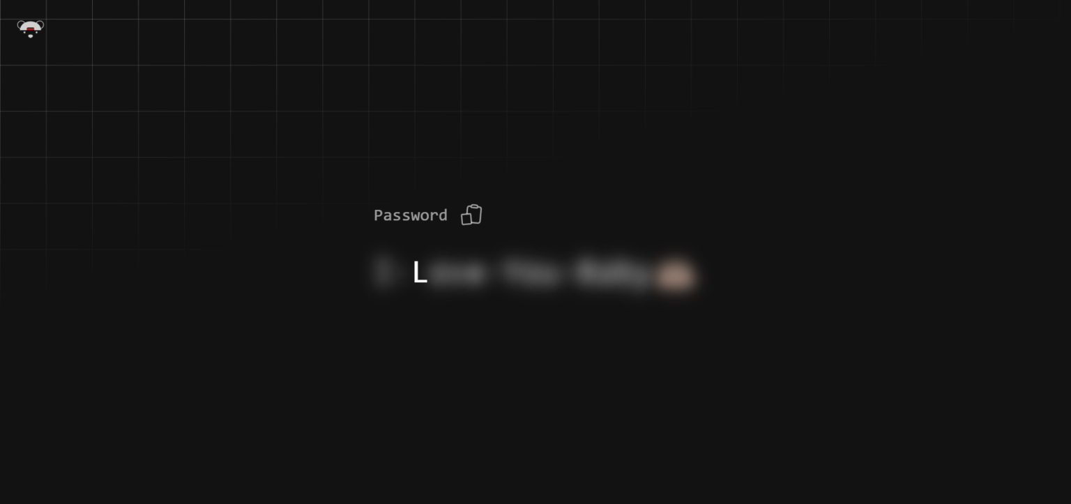
In this tutorial, we’ll build a Hover to Reveal Password feature using HTML, CSS, and JavaScript. This approach provides an elegant user experience, allowing users to see the password they’ve entered simply by hovering over an icon.
Why Use a Hover-to-Reveal Password Feature?
The hover-to-reveal animation is useful in improving user interactions on forms, especially when confirming passwords. By offering a clear visual cue and easy control, users can verify their input without clicking extra buttons or compromising the simplicity of the UI.
Let’s break down the process step-by-step.
Step 1: HTML Structure
Start by creating a simple password input field with a label and an icon that users can hover over to reveal the password.
					<!DOCTYPE html>
<html lang="en" >
<head>
  <meta charset="UTF-8">
  <title>Hover to Reveal Password</title>
  <link rel="stylesheet" href="https://cdnjs.cloudflare.com/ajax/libs/normalize/5.0.0/normalize.min.css">
<link rel="stylesheet" href="./style.css">

</head>
<body>
<!-- partial:index.partial.html -->
<a class="bear-link" href="https://twitter.com/intent/follow?screen_name=jh3yy" target="_blank" rel="noreferrer noopener nofollow">
      <svg
        class="w-9"
        viewBox="0 0 969 955"
        fill="none"
        xmlns="http://www.w3.org/2000/svg"
      >
        <circle
          cx="161.191"
          cy="320.191"
          r="133.191"
          stroke="currentColor"
          stroke-width="20"
        ></circle>
        <circle
          cx="806.809"
          cy="320.191"
          r="133.191"
          stroke="currentColor"
          stroke-width="20"
        ></circle>
        <circle
          cx="695.019"
          cy="587.733"
          r="31.4016"
          fill="currentColor"
        ></circle>
        <circle
          cx="272.981"
          cy="587.733"
          r="31.4016"
          fill="currentColor"
        ></circle>
        <path
          d="M564.388 712.083C564.388 743.994 526.035 779.911 483.372 779.911C440.709 779.911 402.356 743.994 402.356 712.083C402.356 680.173 440.709 664.353 483.372 664.353C526.035 664.353 564.388 680.173 564.388 712.083Z"
          fill="currentColor"
        ></path>
        <rect
          x="310.42"
          y="448.31"
          width="343.468"
          height="51.4986"
          fill="#FF1E1E"
        ></rect>
        <path
          fill-rule="evenodd"
          clip-rule="evenodd"
          d="M745.643 288.24C815.368 344.185 854.539 432.623 854.539 511.741H614.938V454.652C614.938 433.113 597.477 415.652 575.938 415.652H388.37C366.831 415.652 349.37 433.113 349.37 454.652V511.741L110.949 511.741C110.949 432.623 150.12 344.185 219.845 288.24C289.57 232.295 384.138 200.865 482.744 200.865C581.35 200.865 675.918 232.295 745.643 288.24Z"
          fill="currentColor"
        ></path>
      </svg>
    </a>
    <div class="pass">
      <div class="pass__header">
        <label for="pass">Password</label>
        <button type="button" title="Copy to clipboard">
          <svg
            class="clipboard"
            viewBox="0 0 24 24"
            fill="none"
            xmlns="http://www.w3.org/2000/svg"
          >
            <path
              class="clipboard__board"
              d="M15.666 3.888a2.25022 2.25022 0 0 0-.808-1.18262A2.25011 2.25011 0 0 0 13.5 2.25h-3c-1.03 0-1.9.693-2.166 1.638m7.332 0c.055.194.084.4.084.612a.74983.74983 0 0 1-.2197.53033A.74987.74987 0 0 1 15 5.25H9a.75001.75001 0 0 1-.75-.75c0-.212.03-.418.084-.612m7.332 0c.646.049 1.288.11 1.927.184 1.1.128 1.907 1.077 1.907 2.185V19.5c0 .5967-.2371 1.169-.659 1.591a2.2504 2.2504 0 0 1-1.591.659H6.75a2.25023 2.25023 0 0 1-1.59099-.659A2.25015 2.25015 0 0 1 4.5 19.5V6.257c0-1.108.806-2.057 1.907-2.185a48.21804 48.21804 0 0 1 1.927-.184"
              stroke="currentColor"
              stroke-width="1.5"
              stroke-linecap="round"
              stroke-linejoin="round"
            ></path>
            <path
              class="clipboard__paper"
              d="M10.75 8H7.9375C7.42 8 7 8.41067 7 8.91667v9.16663c0 .506.42.9167.9375.9167h8.125c.5175 0 .9375-.4107.9375-.9167v-1.5277M10.75 8h5.3125C16.58 8 17 8.41067 17 8.91667v7.63893"
              stroke="currentColor"
              stroke-width="1.5"
              stroke-linecap="round"
              stroke-linejoin="round"
            ></path>
            <path
              class="clipboard__check"
              pathLength="1"
              d="m10.125 14.1146 1.25 1.2222 2.5-3.0556"
              stroke="currentColor"
              stroke-width="1.5"
              stroke-linecap="round"
              stroke-linejoin="round"
            ></path></svg
          ><span class="sr-only">Copy</span>
        </button>
      </div>
      <div class="pass__input">
        <input
          type="text"
          readonly
          id="pass"
          value="outer radius - padding"
          class="sr-only"
        />
        <span aria-hidden="true" class="fader">I-Love-You-Baby🫶🏻</span>
      </div>
    </div>
<!-- partial -->
  <script type="module" src="./script.js"></script>

</body>
</html>
Here, the input field holds the password, and the span element with the class .hover-icon will serve as the trigger for the hover animation. The eye icon represents the visual cue for revealing the password.
Step 2: CSS Styling
Now, let’s style the container and give the hover interaction its visual appeal.
					@import "normalize.css";

html {
	color-scheme: dark only;
}

:root {
  --font-size: clamp(1rem, 2vw + 1rem, 5rem);
  --speed: 0.25s;
  --accent: hsl(320 80% 50%);
}

body {
  min-height: 100vh;
  display: grid;
  place-items: center;
  font-family: 'SF Pro Text', 'SF Pro Icons', 'AOS Icons', 'Helvetica Neue', Helvetica, Arial, sans-serif, system-ui;
}

body::before {
	--line: color-mix(in lch, canvasText 25%, transparent);
	--size: 60px;
	content: "";
	height: 100vh;
	width: 100vw;
	position: fixed;
	background:
		linear-gradient(90deg, var(--line) 1px, transparent 1px var(--size)) 0 -5vmin / var(--size) var(--size),
		linear-gradient(var(--line) 1px, transparent 1px var(--size)) 0 -5vmin / var(--size) var(--size);
	-webkit-mask: linear-gradient(-15deg, transparent 60%, white);
	        mask: linear-gradient(-15deg, transparent 60%, white);
	top: 0;
	z-index: -1;
}

::-moz-selection {
  background: var(--accent);
}

::selection {
  background: var(--accent);
}

.sr-only {
  position: absolute;
  width: 1px;
  height: 1px;
  padding: 0;
  margin: -1px;
  overflow: hidden;
  clip: rect(0, 0, 0, 0);
  white-space: nowrap;
  border-width: 0;
}

.pass {
	display: flex;
	font-size: var(--font-size);
	flex-direction: column;
	gap: 0.25rem;
	font-family: monospace;
	max-width: calc(100% - 2rem);
}

.pass label {
	font-size: 0.5em;
	font-weight: 200;
	color: color-mix(in lch, canvasText 60%, transparent);
}

.pass__header {
	position: relative;
	display: flex;
	gap: 0.5rem;
	align-items: center;
}

[aria-hidden=true] {
	display: block;
	padding: 0.5em 0;
}

button {
	padding: 0;
	display: grid;
	place-items: center;
	height: 100%;
	aspect-ratio: 1;
	border-radius: 6px;
	border: 0;
	background: transparent;
	cursor: pointer;
	outline: 0;
	height: 44px;
	width: 44px;
	position: relative;
	color: color-mix(in lch, canvasText 60%, transparent);;
}

button:is(:focus-visible, :hover) {
	--active: 1;
}

button::after {
	content: "";
	position: absolute;
	inset: 0;
	background: color-mix(in lch, canvas 50%, hsl(0 0% 100% / 1));
	opacity: calc(0.25 * var(--active, 0));
	border-radius: 6px;
	transition: opacity 0.2s;
}

button svg {
	width: 65%;
}

.clipboard {
	--bg: canvas;
	--control: canvas;
	overflow: visible !important;
}

.clipboard > path {
	transform-box: fill-box;
	transform-origin: 50% 50%;
}

.clipboard__check {
	stroke-dasharray: 1;
	stroke-dashoffset: 1;
	transition: stroke-dashoffset 0.2s;
}

[data-copied=true] .clipboard__check {
	transition: stroke-dashoffset 0.2s 0.2s;
}

.clipboard__board {
	rotate: 5deg;
	translate: calc(20% + (var(--active, 0) * -5%)) -8%;
	fill: var(--bg);
}

.clipboard__paper {
	fill: var(--bg);
	translate: calc(-50% + (var(--active, 0) * 25%)) calc(25% - (var(--active, 0) * 10%));
	rotate: -5deg;
}

:is(.clipboard__paper, .clipboard__board) {
	transition: translate 0.2s, rotate 0.2s;
}

button:is(:hover, :focus-visible) :is(.clipboard__paper, .clipboard__board) {
	fill: var(--control);
}

[data-copied=true] :is(.clipboard__paper, .clipboard__board) {
	translate: 0 0;
	rotate: 0deg;
}

[data-copied=true] .clipboard__check {
	stroke-dashoffset: 0;
}

.whitespace {
	position: relative;
	padding: 0 4px;
}

.whitespace::after {
	content: "";
	height: 4px;
	bottom: 0;
	left: 0;
	right: 0;
	background: var(--accent);
	position: absolute;
}

.char, .whitespace {
	--speed: 5s;
  --blurriness: calc(var(--font-size) * 0.25);
  filter: blur(calc(var(--blur, 1) * var(--blurriness)));
  transition: filter var(--speed);
}
.char {
  display: inline-block;
  position: relative;
}

.char::before {
	content: "";
	position: absolute;
	inset: -2px;
}

:is(.char, .whitespace):hover {
  --blur: 0;
  --speed: 0.2s;
}
.bear-link {
	color: canvasText;
	position: fixed;
	top: 1rem;
	left: 1rem;
	width: 48px;
	aspect-ratio: 1;
	display: grid;
	place-items: center;
	opacity: 0.8;
}

:where(.x-link, .bear-link):is(:hover, :focus-visible) {
	opacity: 1;
}
.bear-link svg {
	width: 75%;
}
.password-containerensures that the input and icon stay in line..hover-iconpositions the icon at the right of the input field, making it easy for users to interact with.- We change the icon’s color on hover to provide a visual indication of the interactive state.
Step 3: JavaScript Functionality
Next, we implement the functionality to toggle between showing and hiding the password on hover.
					import splitting from 'https://cdn.skypack.dev/splitting';

const target = document.querySelectorAll('.fader');

splitting({
  target,
  by: 'chars' });


const copyToClipboard = async value => {
  try {
    await navigator.clipboard.writeText(value);
  } catch (error) {
    console.error(error);
  }
};

const copyMaster = document.querySelector('button');
let copyClear;
const copy = async () => {
  await copyToClipboard(document.querySelector('input').value);
  document.documentElement.dataset.copied = true;
  if (copyClear !== undefined) clearTimeout(copyClear);
  copyClear = setTimeout(() => {
    document.documentElement.dataset.copied = false;
  }, 5000);
};

copyMaster.addEventListener('click', copy);
- mouseenter: When the user hovers over the eye icon, the password input type changes from
"password"to"text", revealing the password. - mouseleave: When the user moves the cursor away, the input type changes back to
"password", hiding the password.
Video Preview Of Hover to Reveal Password Animation
Conclusion
This Hover to Reveal Password technique is simple yet effective. It provides users with an intuitive way to verify their password input without adding extra buttons or cluttering the UI. By combining HTML, CSS, and a small JavaScript snippet, you can achieve a user-friendly and interactive experience.
